


Gridfolk: Interview with Geneus1
Focus on FontStructors | Ata Syed | October 1st, 2021
This is a guest post from Ata Syed AKA thalamic and minimum, the seventh in a series continuing the “Focus on Fontstructors” tradition of interviews with members of FontStruct’s design community. Ata has been FontStructing since 2008.
Psychology 101
What is the psychology of art? Is it the same as the psychological effect of art? We have no better person to explain it than our ever-genius, Gene Buban, better known to all of us a Geneus1. Let’s focus on this FontStructor and Gridfolk him.

G1 Radia by Geneus1
The Psychology of the Self
Perhaps how a person sees themselves is an indication of how they see the world.
Tell us a bit about yourself.
Firstly, I don’t like talking about myself. But I’m opening up here in order to start sharing myself with the world, and specifically the FontStruct community… and because Ata is doing the interview, and is doing an incredible job.
I was born and raised all over the San Francisco Bay Area. I grew up playing video games. I grew up immersed in hip-hop culture, especially breakdancing and graffiti art. I grew up loving and designing experimental letter forms. I grew up using computers to maximize creativity. I grew up with comic books, which inspired me to draw. Releasing cinematic fonts based on new superhero movies was my way of expressing the joy of seeing my childhood heroes coming to life on the big screen. After all these years, the impact of all of these things continues to grow for me, as if I haven’t grown up.
Where do you live and work?
Vallejo CA is in the northern part of the San Francisco Bay Area. In March of 2020, I was in a meeting to talk about the transfer of ownership of one of the longest running virtual reality centers in the US. By June, the physical location was permanently shut down, ending a thriving creative community. This made me more grateful for virtual communities, like FontStruct. The COVID shutdown also forced me to look inward to discover what I want to do in this new reality, and who I want to be. I’ve held roles such as Computer Graphic Specialist, Tech Support Manager, Freelance Graphic Designer, Music Video Producer, Mortgage Office Manager/Trainer, Community College Webmaster, and Virtual Reality Evangelist. But I’ve never accepted the identity of artist, or even font developer as professions. In 2021, this has been, and continues to be, a major part of my evolution.
What kind of education and training do you have?
I have no formal training in font design. In the early 90’s, I entered San Jose State University at the crux of the vector font explosion. I have a degree in Computers in Art, Design, Research, and Education (CADRE) with a minor in Psychology. Many projects involved psychological perception with my passion for graffiti art. My senior project was an interactive art gallery with a top-to-bottom graffiti mural that immersed viewers into the letters as they walked in.
In the recent years, I went back to school to learn coding in C#, Java, Assembly language, etc. After leaving school, I discovered node-based programming on my own and wondered why the hell this wasn’t taught in school at all? For visual artists, nodes are definitely the way to go for game/app development.
In 2018, I began training in Virtual Reality Development in a San Francisco workshop. My project was awarded Best in Class, for my game, Tetrisyde—an escape room game based off the font I created in FontStruct.

Tetrisyde by Geneus1
In 2021, I was chosen with six other multicultural artists to create public art sculptures in the city of Vallejo to represent diversity. The call for artists was seeking 2D artists that were interested in learning to create 3D sculptures in a collaborative environment. Last April, I was fortunate enough to have my work selected by the official judging panel. My sculpture, called Peace 2.0, is a multi-dimensional upgrade to the peace sign that contains the word peace in twelve different languages in phonetic English, and utilizes a font that I created in FontStruct—which I released on September 30th, the day of the official sculpture dedication ceremony. This has been one of the most challenging and enlightening educational experiences as my introduction to sculpture in the public art world.

Peace 2.0 by Geneus1
School isn’t the only place where I receive my education. In the world of technology, change is the only constant, so being autodidactic is what serves me best to create with newly invented creative tools.
What do you do in everyday life beyond FontStructing?
I don’t like reading, but I love learning, so I read because that’s how I learn.
Most things I like to do have to do with making or creating forms of art. Art, music, and dance are the same things to me. Painting is art for the eyes, music is art for the ears, dance is art for the body. Even cooking is art for the palate as well as the eyes and nose.
I love cooking, but I’m very selective since I only eat one plant-based meal a day.
I like all forms of dance, and have performed Hip-hop, Salsa, Swing, Tahitian, African, and Contemporary dances, but breakdancing is still my passion.
I like all forms of art, from painting to sculpture to animation, but graffiti art is still my passion.
I like singing drunken karaoke, but I have a passion for singing Italian opera. I mean, it’s not good, but I love it. Like wildstyle graffiti, I don’t have to understand it to know it is beautiful.
Upon discovering bodyweight calisthenics, I’ve abandoned the gym and created what I call, bboy calisthenics. In conjunction with exercising my creative muscles, I’ve been an active member of the Year of VR Art 2021 challenge, where I create one Virtual Reality painting each week. Last year, I became a World Champion VR Athlete after competing with an international team of gamers in a VR game called SkyFront, where we dominated the entire 8 weeks of gameplay. Currently, I have an obsession involving fractal based algorithmic art and node-based graphics programming
This is all art to me. Creativity flows the same whether it is in painting, music, dance, or font design.
The Psychology of FontStruct
Does artistic expression change with what you choose to express it with? Or does the need to create art remain the same no matter the medium?
How did you become interested in type and typography?
In fifth grade, I had the worst handwriting in class, so my teacher made me write pages and pages of sentences to improve my penmanship, like Bart Simpson writing on the chalkboard. In sixth grade, I took a calligraphy class and became interested in learning as many styles as I could. Always having an affinity for loud, gaudy display typefaces.
While in high school in the 80s, graffiti came on the scene and it became like typographic liberation, as it represented free-form letter design that displayed styles that were indicative of the artist themselves. Each graffiti artist’s name drawn out became a new self portrait. As with breakdancing, I feel graffiti art chose me instead of me choosing it. In breaking, I needed to know all the moves. In graffiti, I needed to know all the styles. This pattern is still evident with my FontStruct library of fonts where you’ll find every design category covered.

Graffikki by Geneus1
What were your first experiences with typeface design?
In 1989, I began working for a video software developer that made character generators—the titling software used in video production studios. The term desktop video became synonymous with the Commodore Amiga computer, which was our development platform. Because our users were all over the world, we needed fonts that had international character sets to support many languages. There were no scalable fonts at the time, so part of the job in the beginning was to edit pre-sized bitmap fonts in preparation for this new thing called anti-aliasing, that smoothed out the edges of the blocky bitmapped fonts which was mandatory for professional video typography. There was a program called Calligrapher for the Commodore Amiga computer that edited bitmap fonts in up to eight colors. I was enamored with its capabilities. Outside of work, I began to create experimental typefaces mainly to be used over video.
In college, I specifically remember the point where I knew I wouldn’t pursue a graphic design major at San Jose State University, when the head of the design department said, “You only need four or five fonts.” I thought, “This person is crazy.” I think I bought Altsys Fontographer for my Apple Centris 660AV out of spite. What followed was a plethora of terrible, terrible font designs.
What other work on FontStruct do you especially admire and why?
Beate’s work has a consistent professionality with each manifested font, with an iconic signature style that is unparalleled.
Thalamic/Minimum. Many thoughtful typographic explorations. But mostly thalamic, that minimum guy is just trouble.
Kix. Fellow graffiti artist with myriad styles.
Elmoyenique. Font Making Machine and Humble Maestro.
Frodo7. I align with his complex experimental expressions as they’ve influenced my own creations.
Funk King always felt like he was having more fun than anyone creating his prolific library of fonts.
Four is particularly inspiring as he is doing things that I would like to be doing personally, with having gallery art shows and involving his typography with his artistic creations.
Honestly, I’m actually inspired by all fontstructions, especially experimental ones. For me, one unique letter can often inspire an entire alphabet.
What are the aspects of FontStruct that make it appealing to you?
It’s fun. It’s easy. Like a good video game, it is easy to learn, but difficult to master.
The limited grid structure makes it easy to create, but also reveals an immediate demarcation of limitations where I like dwelling on the fringe.
A common theme I seem to follow is, “Limit me and watch me thrive.” I mentioned eating one meal a day, and for some it would be difficult, but intermittent fasting has normalized for me, so now it is easy to the point where I’m not limiting myself. Similarly, in FontStruct, the grid no longer is a limitation for me, but a playground.
What would be your recommendations for improving FontStruct?
The software: I would like the ability to import custom SVG bricks.
Also, folders for storing categorized fonts or families can help with organization.
The FontStruct Marketplace: I think the creative output of fontstructors rivals or surpasses the ingenuity showcased by official, professional font vendors. A marketplace where fontstructors can sell their creations would be commercially viable. I would call for a collective of professional fontstructors that collaborate to create typefaces ready for public consumption. Yes, the guy who doesn’t share himself is calling for the best in the community to come together.
The FontStruct Community: Part of improving the FontStruct community is happening now. All involved with sharing themselves in these in-depth interviews humanize the creative font-making process, where we can read about others and see ourselves in their words. Of course, not in reading my case, obviously.
What is needed for the improvement of this virtual community, is what is needed to improve actual, local communities. Support, uplift, and encourage others. Share your technology for making something better.
We’re developing a new consciousness for a new reality. Make it better where you are. Make the communities you are a part of a better place. It’s a process of integrating virtual and local communities.
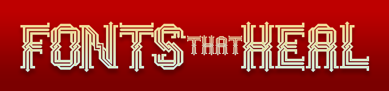
It’s time to be more creative in what you manifest, and how you solve problems. Imagine creating artistic fonts that inspire, elevate, and even heal.
Weaver by Geneus1
The Psychology of Philosophy
The thoughts behind the actions are perhaps as important as the actions themselves. What gets us going?
All things require some skills to achieve what’s desired. How does one gain the requisite mastery?
Get back to basics. Discover and develop your own process of creativity. Know your process. Work your process. Visualize. See your work for what and where it is, then see it for what can be. Analyze and adjust. Improve and evolve. Anthony Robbins teaches CANI or Constant And Neverending Improvement. Developed from the Japanese term kaizen. I believe in these terms, but it also hinders me, because I sometimes withhold creations because I think they could be better.
Always A Student is a term in the hip-hop community that I have always identified with. I’m usually in the mindset of a student seeking to find answers, usually answers that stem from new ways of addressing solutions to a problem. But I don’t really consider myself a master. My methodology is more Salieri, than Mozart. Whereas Mozart was able to play his music forward, backward, and upside down, I create fonts like Salieri building one musical note at a time trying to find what options work best for me. I go through multiple variations of many letters before deciding on final versions.
In the early stages when the output is not worth sharing, how does one maintain the motivation to continue?
Do what you love, love what you do. Everyone has to begin somewhere, but passion for a craft is enough to influence the beginning stages of any artistic endeavor.
Temet nosce. Know thyself. Keep creating because you love it. Keep doing it because it is part of who you are. A prolific sculptor at a workshop mentioned he spent the first 5 years not getting a positive response from entries into public art calls for artists. He was able to continue because he knew himself and trusted in his own artistic progression.

CloneWar by geneus1
In terms of motivation, both positive and negative feedback can be useful. Positive is easy, especially when it is from someone you respect. It is also easy to brush off negativity from someone you don’t know. But when someone you are close to is honest enough to negatively criticize and not blindly praise, this can be used to provoke positive action, as it gives you the opportunity to prove them wrong.
In your opinion, what role does education (formal or otherwise) play in excelling at something (artistic or otherwise)?
Education is paramount in order to excel at all things. Learning how to learn isn’t really taught in schools. I like to say, “Never let school get in the way of your education.” Not to put down any teaching profession, but to make a comment on how many educational institutions intrinsically provide what they want you to learn, instead of catering to what the student wants to learn. Albert Einstein was erroneously attributed to have said, “Everybody is a genius. But if you judge a fish by its ability to climb a tree, it will live its whole life believing that it is stupid.” This parallels my acceptance of the identity of artist instead of fish, and how I’ve previously been climbing trees to prove my worth of what society wants me to be. For now, I’m just going to keep swimming.
Artistically, there is also internal and external education. Internally, you educate yourself in what you like to do and what you’d like to create for yourself to share as your own personal expression. Externally, you educate yourself on the creative community that resonates with you, and what your peers are doing in order to know if you are contributing something new to that collective artistic consciousness.
How susceptible are we to not seeing our own work objectively?
For myself, as an empath, it is difficult to not see my own work objectively since personal feelings of the work are embedded into my process. Emotion drives my work. In order for there to be consistency in a font, there may be a feeling that I get from one particular glyph, and the extension of that emotion from a single character needs to be expanded to every other character to balance energetic patterns. In order to see my work even more objectively, a change in perspective is always helpful.
As I’m writing this, I’m seeing that many things I say can be explained as fractals. Looking at a typeface as a whole, then zooming in to see repeating patterns in the details. Analogously, I change perspectives by seeing a letter as an individual person, seeing a word as a gathering of friends, seeing a sentence as a larger party, and seeing a paragraph as a community meeting. All this works together to identify what works best in how they are communicating at each level, how close they should all be together, who fits where, and what needs to be adjusted and balanced for everyone to have their say from the individual to the collective.

HulkSmash by Geneus1
What is the harm of thinking your work is better than it is?
There’s probably more hilarity than harm in thinking your work is more outstanding than it really is. Singers on the show American Idol come to mind – you know, the ones that don’t know they can’t sing. This would be the opposite of “temet nosce.” Not being able to see yourself accurately prevents you from making improvements where they need to be. I’ve heard many singers say, “I don’t like to hear myself sing.” To which I reply, “If you don’t like to hear yourself sing, what makes you think others will?” It is just as bad when someone close to you approves of your own incompetence in order to stroke your own ego. Bypassing the ego can allow you to see yourself, and your work, more clearly.
As evident from your previous answers, you are continually evolving yourself and your work. When all is said and done, what would you call a life well lived?
A life well lived would be a life of no regrets. The things we regret are usually the things we didn’t do.
From the perspective of a creative, sharing your work plays an important part. Being creative, inspiring creativity, teaching creativity – all contribute positively to a world that seems to be delving in the opposite spectrum of division and destruction. Creative people offer light where there is darkness, especially when adding beauty to functionality. This is what fontmaking can be – the visualization and beautification of abstract thought rendered through lines and shapes representing linguistic communication in a functional system presented as digital typefaces. This is how the FontStruct community lives. Live your truth. Live purposefully. Live authentically. This is how one person can change their world for the better, whether their world consists of one’s family, one’s local neighborhood, or one’s global virtual community of font makers..
That’s it for me. Let the psychoanalysis begin….
The Psychology of Analysis
Analysis is a double-edged sword. You can’t determine the phenomenon under study without it and yet, somethings are best left unanalyzed.
From the preceding, it should be clear that Gene is a complex person. There is great thought behind every action and decision, meaning there is analysis of the self, of the situation, of the effect, etc. This doesn’t normally happen; it takes a genius to do that. It is fortunate for all of us to have Gene and similar others like that at FontStruct.
Thank you Gene, and Ata, for another fascinating interview!
I wonder how long it takes Ata to do these interviews?
– BWM — October 1, 2021 #
Again, another wonderful interview! Congratulations to both Gene Buban (Geneus1) and Ata (Thalamic & Minimum). As the weather begins to turn colder (or warmer, depending on your hemisphere), I’m glad to see this series continue on! :^)
– Goatmeal — October 1, 2021 #
Another great interview right before my eyes, another excellent opportunity to get to know one of the people I admire at FontStruct more deeply. Summer is gone, but the great interviews continue! Thanks, Gene and Ata!
– elmoyenique — October 1, 2021 #
Another great interview right before my eyes, another excellent opportunity to get to know one of the people I admire at FontStruct more deeply. Summer is gone, but the great interviews continue! Thanks, Gene and Ata.
– elmoyenique — October 1, 2021 #
(Sorry, slow computer…)
– elmoyenique — October 1, 2021 #
Continually fascinated and intrigued to read about such talented typographers, this entry furthers that idea~
– time.peace — October 1, 2021 #
Thank you Ata, for putting together another really interesting interview, this series has been a massive undertaking! Thanks Gene, for sharing your thoughts on fontmaking, learning, creativity and life!
– four — October 3, 2021 #
This has been such a great series of interview. I hope to see many more of them!
– zephram — October 15, 2021 #