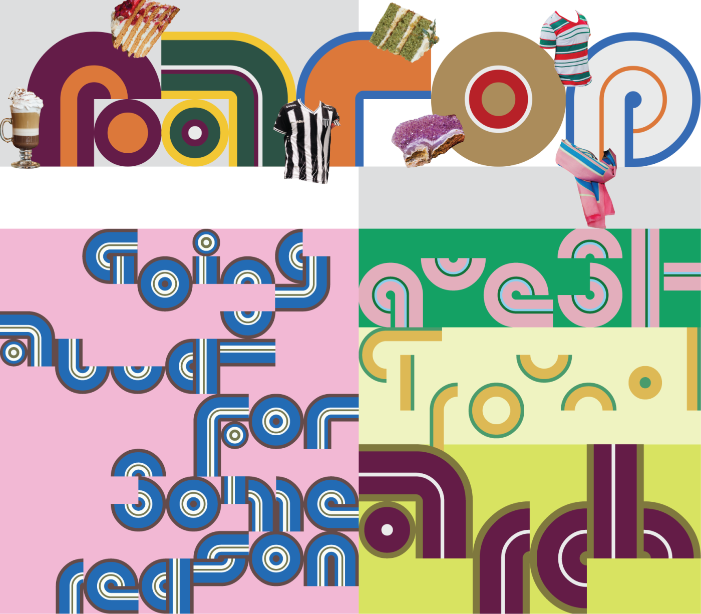
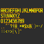
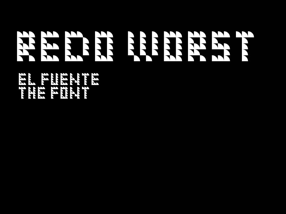
A lovely experiment! A little hard to read in some places, (the “Y” in particular is quite confusing) but with such a small grid, it’s more than forgivable. Fun samples, too.
@Goatmeal - Thanks! There was a little bit of inspiration from Uncials on some of the capital letters, but mostly from trying to imagine how an edged pen or quill would look.
This is nice! I like how you executed a Futura Black-style form but with a gridded/tiled system. You should readjust the space character though; it's too wide at the moment.
















Well, that was to be expected. Same as always. ; )
»