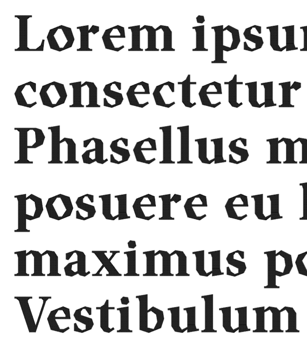
A very refined faceted typeface style. As a result you have
created a beautiful font. I quite like the shapes of each glyph.
They conform to your creative logic
One of the problems we mentioned is that there's
nothing "new" being created anymore. The book has a similar issue
that is brought up—but instead of a typeface, it is a song.
@caterpillar's.kimono: I'm new here, great font btw. I'd ignore the negativity, nothing about that font is underwhelming. I don't think everyone manages to grasp the finer points that exemplify a good critique.
@elmoyenique: My lowercase o is way bigger. Its
design is airtight: one brick overshoots at the top and bottom, no
wobbly bricks or misaligned corners. The axis
@elmoyenique: Thank you for your comments and helpful
contributions. I always valued your opinion and considered it
seriously. Type design is a subjective matter;
(I didn't want to deal with FS comments today. We had
parliamentary elections yesterday, and the ruling party has been
defeated. The whole political system may change,
I don't know how to put it, but I'm not entirely convinced by
the letters with large curves here (C, D, G, O, c, e, p, q...). I
can understand that this might be the defining characteristic of
the font, but it just doesn't quite work for me. I tried a
similar




Wonderfully done!
»