3 new letters
SHIDDIN????? WHAT???? Ist SHIDDIN FONT?
thx
Cool font
@AskGamerViennaBinders - Yes, @Bryndan W. Meyerholt (BWM) is correct. FontStruct composites are currently limited to a maximum of 16 bricks.
v1.07 update: greek and coptic completed!
certain letters are too wide, therefore not a monospace font
La Fhéile Pádraig?
i just don't understand my life at all tbh "\_(._.)_/"
the bug got fixed yippee!!!!!!
@elliqvl ok i’m going to change back to my main account if the bug is still there or not
@elmoyenique i’ll try to contact him later
Interesting...
For these kind of problems, please contact Rob Meek using the FS Contact page.
i just made a few glyphs in my (deleted) font, then boom! that server error pops up again. maybe something has a bug in the fontstruction editor?
Me too, but I try to save one-by-one, and it worked
Thanks a lot guys! Noted on that @TypoMan Foundry. @Bryndan: Here are the individual 'macaroni' bricks I used to layer them over each other
@AGVB Composites containing more than 16 total grid squares cannot be made as of writing this, and all of those require either 60 or 64 bricks.
How about a composite that is:
1. 8 x 8 (square) 2. 6 x 10, 4 x 16, or 2 x 32 (vertical) 3. 10 x 6, 16 x 4, or 32 x 2 (horizontal)
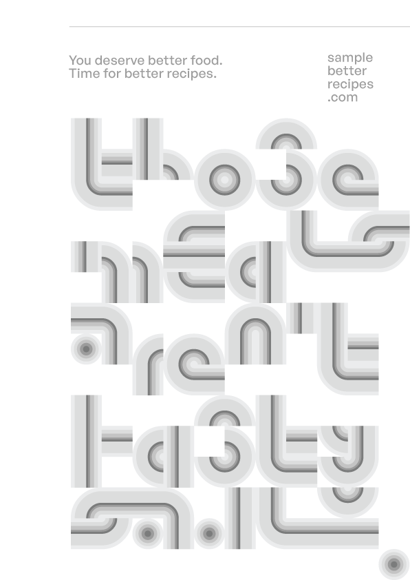
Pretty nice font. I wonder how you made the gradient for this?
@TypoMan You could add that to your bio. You might also want to check for overlaps and self intersections on your Hypnos font (from the 1001 fonts URL on your profile).
Totally, Lvqille.
Wow! I never seen this! Also i'm Jeyco with a foundry. I don't know if you see my comment in Ricecake.
"Each character is 9x16px, and the font is best rendered at a size of 13px."
Due to the "4 px:3 pt" scaling ratio on Windows, it is best done at multiples of 10.5 pt.
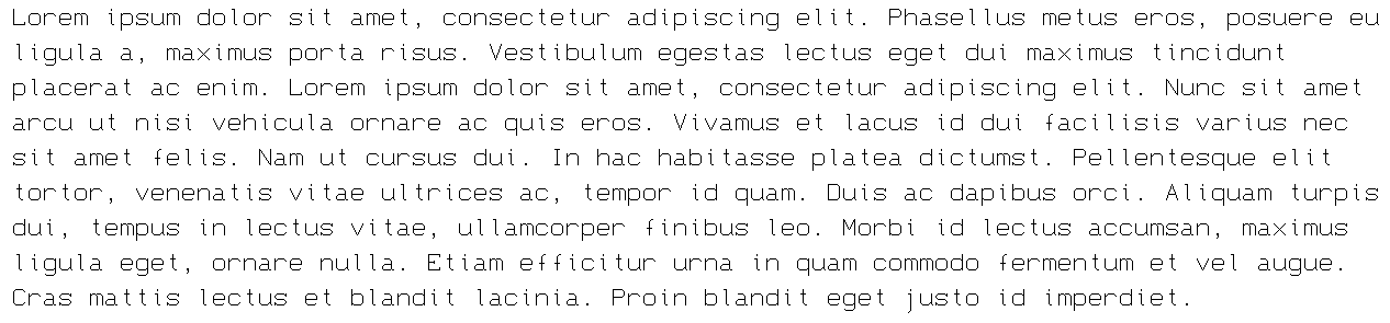
Sample Text
@fruptile i don't get what's going on either "\_(._.)_/"
@18man what am i saying
@ingifn you are wrong, it's spelled like that on purpose
@faux_icing - A very interesting effect. I've always been a fan of gradients! :^)
May 2 2026:
Completed More Latin section.
Added Greek Alphabet and other stuff.
Good point @Goatmeal.
Good font! Although you should remove the tittles of the accented lowercase i's.
One word to describe this: awesome







3 new letters
»