I really like this! It feels like C and G would look more in tune with the rest of the letterforms if they had a sharper upper tip (and in the case of C, maybe a lower tip of the same kind as the one on Q?). I dig the style a lot, good job!
Понял. Кернинг был очень скучный для латиници тоже. Прямо сейчас
я делаю кернинг для ещё огромного шрифта, и я думаю что у меня
случится припадок! После
@TH3_C0N-MAN: Очень нравится твоя А - но делать кернинг для строчных лень и это добавит разнообрвазия шрифту. Я и для других букв добавил новые версии. А для IILO сделашь кириллицу?
I would definitely do that if I intended the font to be more playful. If that was the case, I’d have more diagonal cuts on other letters too. Maybe an idea for a future clone
I didn't expect so much arguing about this font. I was going for a 3D effect and thought it looked pretty good. However, I will make changes like I said in a previous post.
Hi! I really like your Panasonic 8561 font recreation. Would you
consider adding lowercase Cyrillic characters (U+0430–U+044F)? The
uppercase Cyrillic set
1: E and F may seem too big, but they actually have the same
proportions as they do in other typefaces such as Helvetica Ultra
Compressed, Swiss 911 Ultra Compressed, and Antonio.


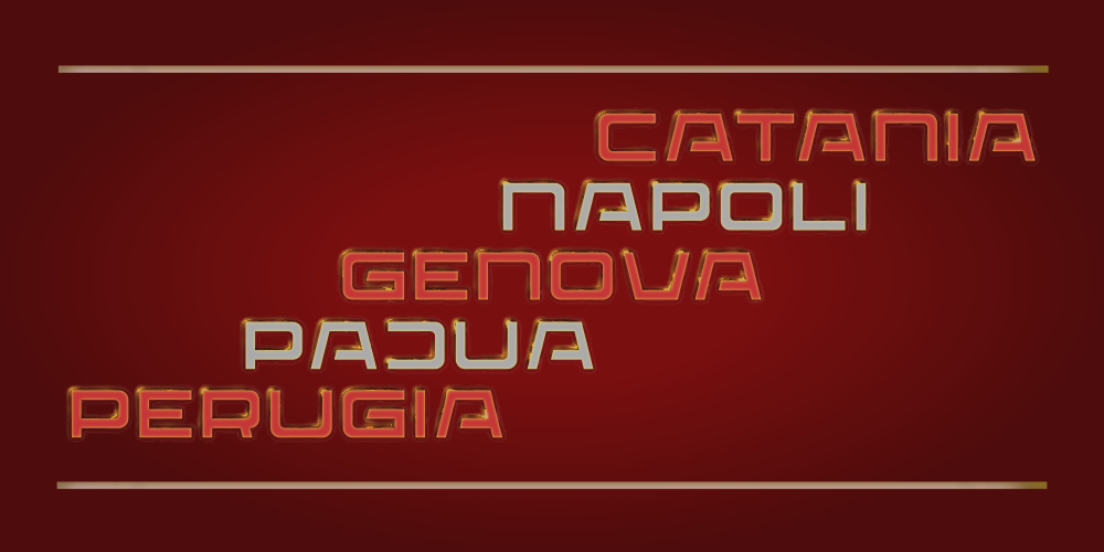
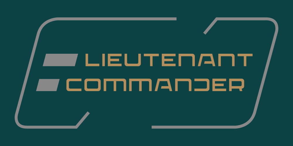


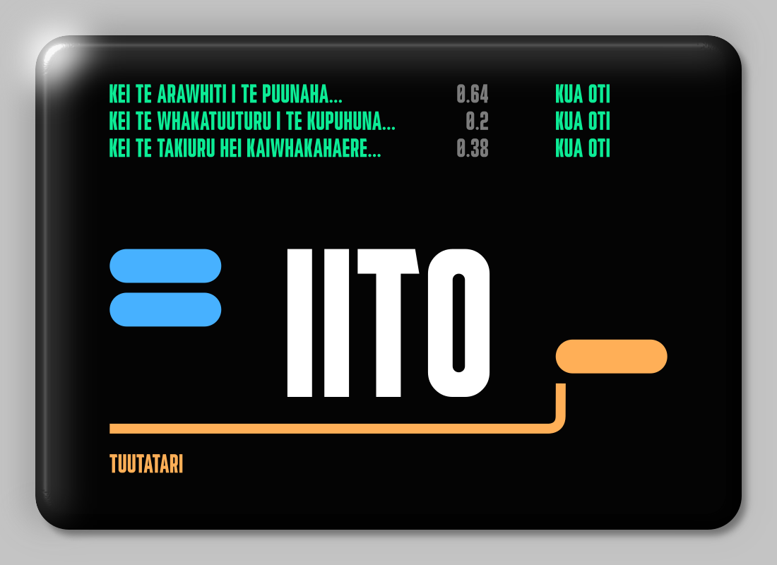


I really like this! It feels like C and G would look more in tune with the rest of the letterforms if they had a sharper upper tip (and in the case of C, maybe a lower tip of the same kind as the one on Q?). I dig the style a lot, good job!
»