For example, the yellow lines are looser than the green lines. Top decoding: correct text (braille). Bottom decoding: incorrect text (black is invalid text and/or punctuation).
@Goatmeal This font was published on 11/28/2025, while PW-Blacker Grotesk was published on 11/18/2025. The date of creation is not necessarily the date of publication.
The letters B, C, D, G, H, I, J, L, O, P, S, T, U, V, Y look inspired by our PW-Blacker Grotesk font, check out in the TP list. By the way, your fonts are great!
I made a logo with your font! - Made in PowerPoint
The MineSweepers, stylized as "The M1NESWEEPERS!" is a fanmade
series inspired by NumberBlocks - The MineSweeper numbers have the
color of algebraliens. This explains why the 3rd "E" in
"Sweepers" is white (Nine) and the "R" is orange (Ten).
Eh. I'll scrap 8x8 and 10x10 completely to avoid confusion
between the two lads. Also, my other font (DogeBork Regular,
WIP) has a metric of 1 block/pixel/brick/whatevryacallit thick
5x5 circles, and I'm making a third font based off some of the
tutorial pics - To be exact the "make a composite" ones where a 4x4
"A" and "B" are shown as examples. 4x4 and 5x5 would work
perfectly on their own. So, as a result of this, I'll only scrap
8x8 and 10x10 to make life easier.




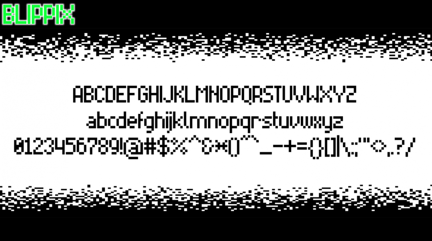


Are those cascades on sloped parts in the glyphs like A, K, Z, etc. intentional, or you just could not find suitable composite bricks?
»