Very normal, but it is great. Also, I am JeycoMonge with a foundry (maybe you remember me).
Which glyph is the triangle?
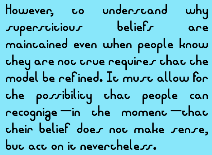
Ah,Spaceyes, ̇SpaceyouSpacehaveSpacetakenSpacetheseSpaceglyphsSpaceliterally·
@Skilgrrr - "The condensed default spacing was only for problems I've had when exporting the font to other services." Completely understandable;
Czech* twice
to the official logo
...compare the fontstruction...
Did you already Czech in? *pa-dum-tss*
FUN FACT: this is the version of the font used in the "make fonts, not war. нет войне." version of Fontstruct, down to the i (и) being written as u. :)
Like it!
^ I already figured that out recently. The kerning is for misc features that make the font look neater, might have to remove the notice to use
I live in 4
update: cyrillic extended a-d will be added
@Skilgrrr - Unless this design where glyphs merge together is intentional, you can adjust the overall spacing width of each character, as shown in






Very normal, but it is great. Also, I am JeycoMonge with a foundry (maybe you remember me).
»