Pretty nice font. I wonder how you made the gradient for this?
@TypoMan You could add that to your bio. You might also want to check for overlaps and self intersections on your Hypnos font (from the 1001 fonts URL on your profile).
@typoman you don't have to tell everyone that you're jeyco, you can put that in your bio
Totally, Lvqille.
Wow! I never seen this! Also i'm Jeyco with a foundry. I don't know if you see my comment in Ricecake.
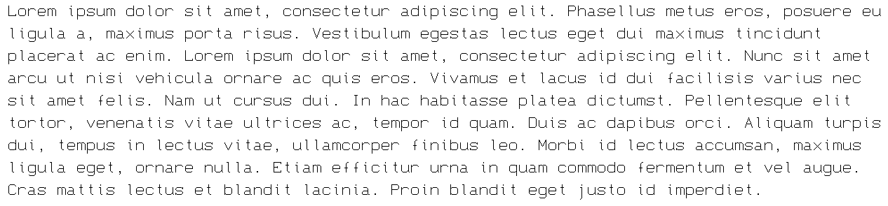
"Each character is 9x16px, and the font is best rendered at a size of 13px."
Due to the "4 px:3 pt" scaling ratio on Windows, it is best done at multiples of 10.5 pt.
Sample Text
i don't understand anything here
@fruptile i don't get what's going on either "\_(._.)_/"
@18man what am i saying
@ingifn you are wrong, it's spelled like that on purpose
why did you comment "completed more latin section" twice?
@faux_icing - A very interesting effect. I've always been a fan of gradients! :^)
May 2 2026:
Completed More Latin section.
Added Greek Alphabet and other stuff.
Good point @Goatmeal.
Good font! Although you should remove the tittles of the accented lowercase i's.
ngl i agree with @dpla
cool ffont




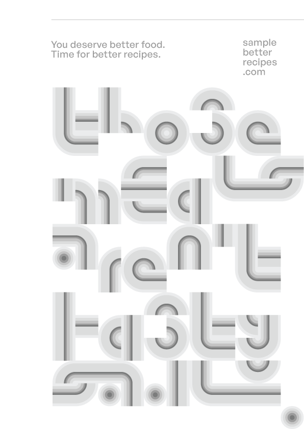


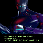


Pretty nice font. I wonder how you made the gradient for this?
@TypoMan You could add that to your bio. You might also want to check for overlaps and self intersections on your Hypnos font (from the 1001 fonts URL on your profile).
»