


Improved Download Quality
News | Rob Meek (meek) | May 26th, 2010
Today we made some changes to the “FontMortar”. The FontMortar is the part of FontStruct which actually generates the font files which you can download and use on your desktop.
It’s just better
As far as possible FontStruct tries to hide the dry, technical side of font design from you, the designer. If you just want to have fun with shapes, build your font and download it, then FontStruct was made for you and you can leave this post now, happy in the knowledge that we’re continuing to improve the quality of those downloads.
I’m still here. What’s changed?
Apart from a number of essential bug fixes related to the recent update to FontStruct 2.0 there are two big improvements:
Partial-width bricks no longer screw-up letter spacing
Partial-width bricks are shapes which do not extend across a full grid square. FontStruct 2.0 has greatly increased the number of partial-width bricks available. Until now the letter spacing would often be calculated incorrectly for FontStructions which had partial-width bricks on the extreme left or extreme right. Many fonts would look fine online in the previewer but terrible when downloaded and used in desktop software. This made such fonts very difficult to use in practice. The problem has now been fixed. Compare the following text set using old and new downloads of “Fraktured Humanity” by johndilworth (no manual tweaking).
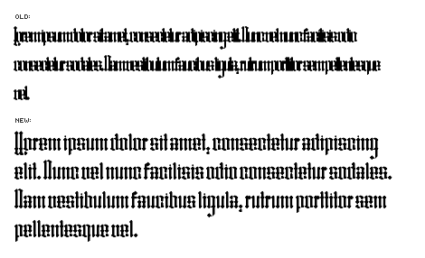
Better huh?
CAVEAT: There is one case which is still not working perfectly. If you use filters to scale your bricks horizontally to a scale greater than 1 and also mix automatic and manually-set letter widths, you will probably still see some inconsistencies between the online preview and the download on the right-hand side of letters. Setting the width for all letters manually should provide consistent results in such cases.
Superfluous control points massively reduced
We’ve improved the algorithm which removed unnecessary control points in downloaded fonts. This is a huge qualitative leap and means that FontStructions will have a much smaller disk and memory footprint. Compare these before and after images showing the A from “Union New” by aphoria.
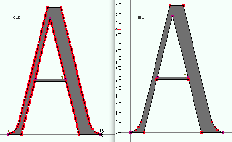
In the old version, the letter contained almost 150 control points. In the new version it’s less than 15! The actual letter forms are identical.
I don’t see any difference in my downloads
Many downloads will simply not change noticeably. Also, the new improved downloads will only become available as and when the respective designers change their FontStructions in some way. Why? To save resources, all downloads are cached. This means that the system only generates a new font file when something relevant changes — the design itself, the name or the license. We don’t plan to clear the cache completely at the moment, so if you want to download a new, improved version of one of your existing fonts you will have to clear the cache for this file. To do this, either save the FontStruction, or just click on the “Save Changes” button on the respective FontStruction page to clear the cache before downloading. You only need to do this once.
Important
These changes to the FontMortar may affect both the horizontal spacing and the vertical metrics (the “size” and linespacing) for your downloaded fonts. If you have used your FontStruction in a layout you may want to save an old version of the font somewhere for use with that layout — so the layout still works exactly as before.
This is just a little message to tell you that the improvements did not change my problem of disappearing bricks and ugly circles. I clicked on Save Changes, even changed the name, but nothing occured. I think I viewed too big with this grid;
– neurone error — May 26, 2010 #
Rob, I’m glad FS is getting better and better!
The letter-spacing issue bothered me for some fontstructions of mine (Bromance is the latest), and the same was true for the superfluous control points (Dioptical was a mess when converted to outline).
Anyway as concerning the latter, some glitches are still there: for example the “marlboro” bricks still connect with a dent to 45-degrees-diagonal bricks. But maybe this depends on a small fault in the shape definition of the “marlboro” bricks themselves…
– Em — May 26, 2010 #
@neurone error Not sure about the disappearing bricks. I’ll have another look at that. There is another improvement to come which may help with the circles a bit but it will be a while before that is released.
– Rob Meek (meek) — May 26, 2010 #
Thanks, I’ll wait and see.
– neurone error — May 26, 2010 #
I’m still having Partial-width bricks screwing-up my letter spacing. Particularly T,V,j,q,v in NCD Amphibian Stencil. Any clues as to where it’s going wrong.
Brilliant move with the superfluous control. That’ll save me a lot of time, in Illustrator.
– djnippa — May 26, 2010 #
@djnippa – thx. I will look this evening.
– Rob Meek (meek) — May 26, 2010 #
Thanks for the constant improvement, Meek! I’ll have to wait for future partial brick width improvements, since I’m hardly ever using an unfiltered setting. Just tested it, and 2:2 filters are affecting spacing. The control point optimization is a long awaited and welcomed improvement. Very clean output!
– geneus1 — May 26, 2010 #
@djnippa – I think maybe the cache wasn’t cleared for your font. I think it’s better now. Let me know if not.
– Rob Meek (meek) — May 26, 2010 #
@Emilio You were right. The marlboro bricks were a little off. They’re fixed now. Dioptical is down from 311Kb to 57Kb.
– Rob Meek (meek) — May 26, 2010 #
@geneus1 yes the filters are still problematic as mentioned in the post and I know you almost always use them. I think you should still be able to get consistency if you set every character width by hand though.
– Rob Meek (meek) — May 26, 2010 #
Thanks for the feedback everyone. Please keep it coming.
I’ve made some adjustments to the new FontMortar.
The chopping off of descenders experienced by Windows users should be fixed now. Thanks to aphoria for pointing that out.
I also made an adjustment to the letter width for users who don’t set that manually (I forgot to add the default single grid square spacing).
– Rob Meek (meek) — May 27, 2010 #
Thanks Rob, it’s working great now.
– aphoria — May 27, 2010 #