Hey, Frodo7.
Sorry to hear your feedback. These ligatures are placed in
Alphabetic Presentasion Forms, and this glyph is added as a
fallback/placeholder
Having ligatures in a monospace font is useless and beats the
whole purpose of monospace. It is self-defeating, especially when
you position your font for computer code. The lowercase
Thank you SO much for making this! I've been waiting for someone to make a font accurate to the Texscan screen! Only issue I have is the kerning being way off, but otherwise, this is great!


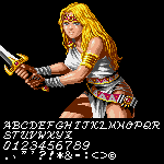


Thanks, there is certainly room for alternates.
»