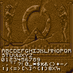
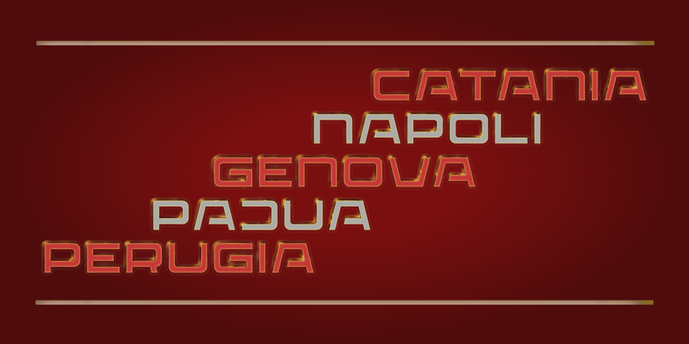
I really like this! It feels like C and G would look more in tune with the rest of the letterforms if they had a sharper upper tip (and in the case of C, maybe a lower tip of the same kind as the one on Q?). I dig the style a lot, good job!
Excuse me, but how did you end up with these quotes, when the only thing that needed to be in purple is highlited with black borders, here in the above sample, and doesn't cover everything?
Понял. Кернинг был очень скучный для латиници тоже. Прямо сейчас
я делаю кернинг для ещё огромного шрифта, и я думаю что у меня
случится припадок! После
@TH3_C0N-MAN: Очень нравится твоя А - но делать кернинг для строчных лень и это добавит разнообрвазия шрифту. Я и для других букв добавил новые версии. А для IILO сделашь кириллицу?