S, looks very nice, you should finnish lowercase.
I like it. You can add more symbols
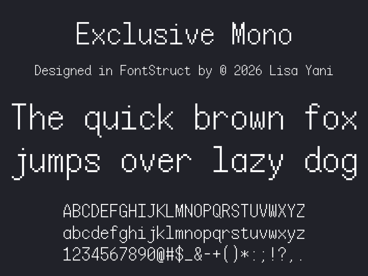
Doruk9, done: @ is in now. Thanks for asking!
I love how the cracked, broken texture gives these letters a glitchy, weathered energy. As a curious researcher of fonts, I keep coming back to pixel work like this for inspiration.
AaMmAaZzIiNnGg!






S, looks very nice, you should finnish lowercase.
»