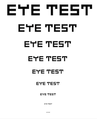
The m looks really good.Its such a good style, the whole font deserves more attention.
Love the variation in size and the different positioning of the letters. Handwritten pixel fonts are awesome, 10/10! the sample is great as well.
There is some distortion on the Y & e glyphs, extra thickness.
Wow,
i enjoy cursive fonts and this is no exeption
Unicase finally fixed successfully
Slanted..
Support for Unicode 18 added.
Great


.jpg)




The m looks really good.Its such a good style, the whole font deserves more attention.
»