@BWM It probably is too thick - I meant that to be more of an
example of how I'd scale up the font, but I'd of course refine it
so that the lines are equal (or
If it helps, I have a font with all the slopes you might need (1:1, 3:4, 2:3, 1:2, 1:3, 1:4, and 1:6, all with (near-)unit width lines and corners in all orientations).
I don't really know if Engsvanyali is useful, because it turns into different characters when you type a letter from that language repetitively, and it actually goes backwards like Arabic.


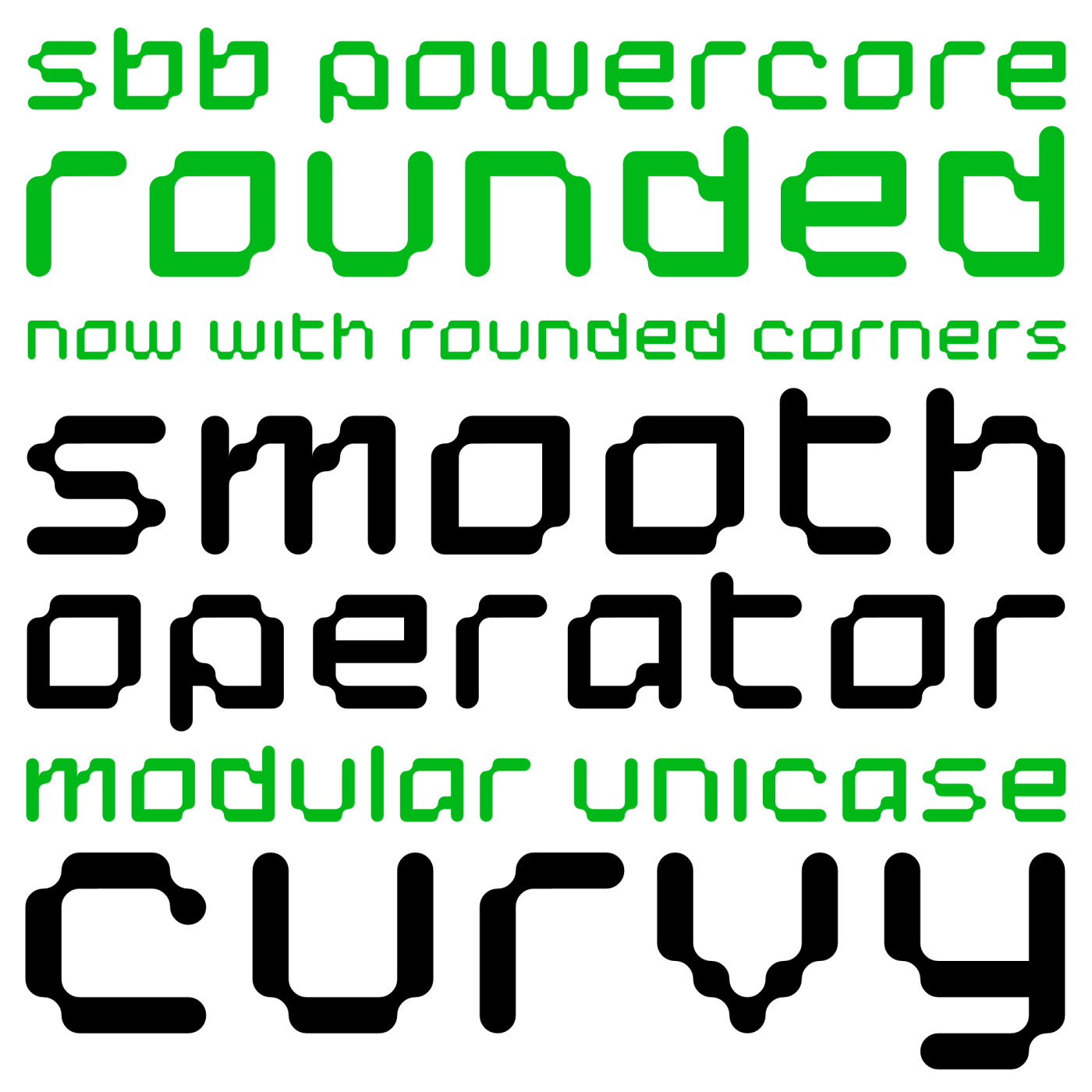


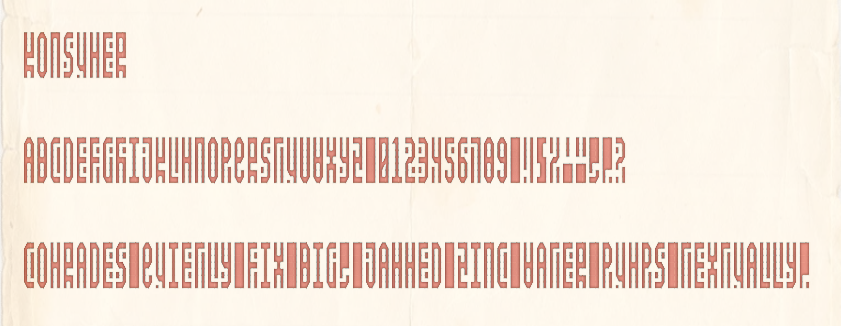
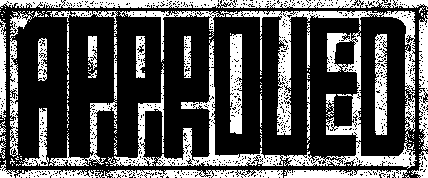


Other font used in this sample: Between the Lines.
»