i had a road map that went:
quartile slab -> imisislab -> triplequartile slab -> slab
i made the first two, but realised that imisislab
i made the first two, but realised that imisislab was already
between versions 42 glyphs were added
version 2: 26X25, addition of lowercase letters, all remaining basic symbols and the creation of slab
@Can'tfind1usernamecanI? the font used changes width, probably to adapt to different screen ratios (such as 16:9 to 3:4 to 5:4 etc) i guess
How about this
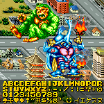
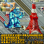
This is what the font would look like on an actual EAS screen.
In Schools, Teachers Know What is the 1st grade
DiH🥀
Can you fix your font
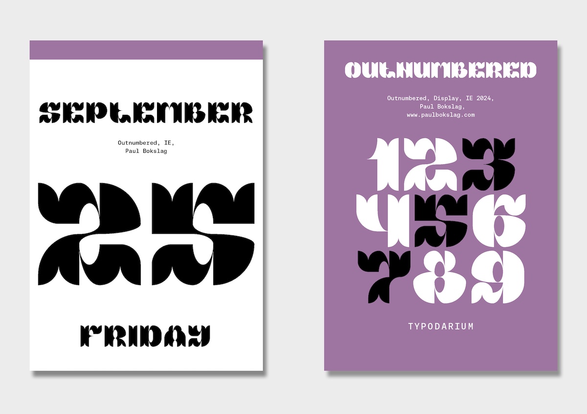
Digits 0-9 are o
Strong and consistent. The serifs in the top left corner are a nice touch.
Powerful contrast between heavy strokes and small counters. The kerning lifts it to the next level.
Beautiful curves, a wonderful piece of work!
yay new update
ngl i feel like u have a problem on saying peoples real names (not to be rude)
This looks similar to 9x5 Ultimate...
Where did you make it with?
yes
It seems the turn has table'd.
I am, 84
Yes.
Redesign the vulgar fractions 1/2; 1/4; 3/4 so that it is consistent with the other vulgar fractions (in the number forms block) PLEASE.
@avianity gigantic grids
@athemwulf ngl that looks more accurate
*it sounds annoying to say something already said
can you please not say the description? it sounds annoying
*Sorry: "14" years...
@PoonCheeHim - Because EZMonoB was released 15 years before Yapari (2008 versus 2022), it would be far more accurate to say that Yapari looks like this...








i had a road map that went:
quartile slab -> imisislab -> triplequartile slab -> slab
i made the first two, but realised that imisislab
… more