@Frodo7 @Goatmeal, I tried fixing the angles of the M in my State font. I can clearly see the difference using the tutorial that was provided. I am very happy with the result.
@Frodo7 I always wondered why the angels were too thin or too
thick. I thought it was because of the bricks themselves and
how they are placed. Before constructing a new font, I use a
graph composition book to
Dear FontStructors. To counteract spam and other unfontstructive behaviour, we will be experimenting with comment moderation over the next few days. New users, please check out our commenting guidelines.












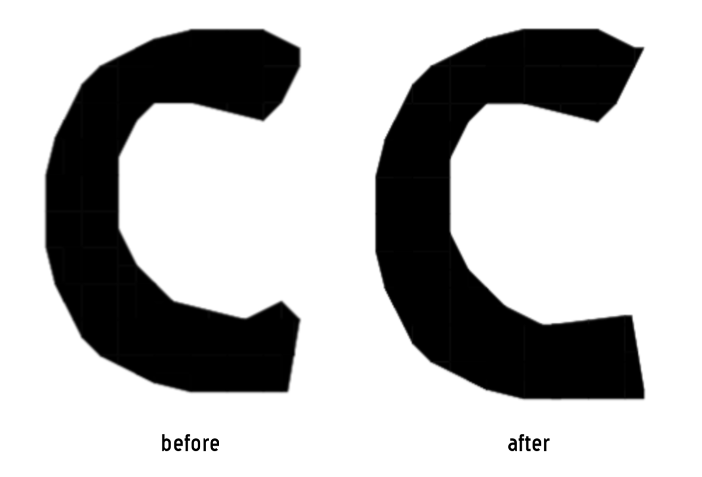


@Luca Prieto (lvqille backupukcab elliqvI) Yup. Helps out a lot with fontstruction.
@Bryndan W. Meyerholt (BWM) That's how I created the font.
»