@goatmeal they fixed it in the actual main game font. still no idea why they felt the need to have two separate sets of numbers and punctuation… https://fontstruct.com/fontstructions/show/2962796/defender-of-the-crown-game-c64
@Patrick H. Lauke (redux) - Very nice! Although, the number 1 is a little bland. The designers should have put in a little more effort to make it stand out!


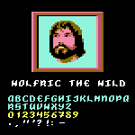


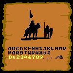


@Patrick H. Lauke (redux) - Yes, that is a very odd choice! Especially since one wouldn't expect very many numerals to be used in an introduction!
»