this is my 1st font :D
@ctcg_ mine too
@ctcg_ why brag thouugh?
but my display fonts are not meant to be downloaded
In more Latin, you added diacritics inside the letters?
Thanks for @Stinkyrhino678 to make my work your favorite!!
But display fonts are meant to be downloaded! 🤦
@ctcg_ i’m speechless
my gosh @ctcg_
the font is back after terry told me to delete my whole entire fonts
i hate people downloading fonts meant for display!
this is for display only
Add every latin character encoded in unicode 18.0
Поздновато пишу, но это всё так же охеренно
@18man wow!! it looks better and smooth! however, i’m not an expert in making slopes because i don’t know how brick stacking works...
an example for a symbol that would be much more readable if you added slopes is: &
use the slope bricks for diagonal lines????? (it's ok if they're thinner than other strokes)
Where TF is the Russian letters
👍


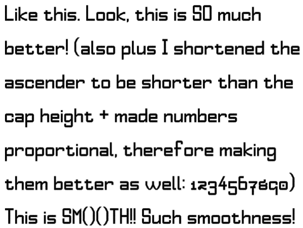


this is my 1st font :D
»