the reason why this font is for 12+ cause it SCARES LITTLE KIDS!
Nice work! I have been working on a similar outlined typeface myself but with more rounded corners.
You can consider making the legs of 'J' and
What about this new tilde? This can be a new solution?
@ctcg_ i have a question. why are some of your comments have bad grammar? you usually type in good grammars, which is odd...
Only if this were a display-of-your-taste (i.e. all rights reserved) font.
You didn't removed serifs in other glyphs!
Excellent for Minecraft.
How we can 10000 glyphs? (FONTSTRUCT EDITOR WILL BE MAKE SLOWER)
@Luis Becerra: Nice try. Waiting for the rest.
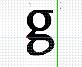
The letter g (same font)
Who makes ages for font uses?
24 March 2026 19:22 (GMT) I New 10 thousands glyphs.
i think it would be inconvenient as the minute hand would "snap" to 1/8 of hour instead of 1/12 of hour
made it proportional
Fixed.
@18man: Yes! Exactly!!
It looks like the Futuracha font.
Nope
Dude, … more redirects to a "... more" text. Is this XML markup?
i think the problem was with Word (R)




the reason why this font is for 12+ cause it SCARES LITTLE KIDS!
»