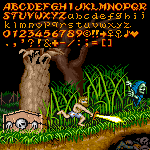
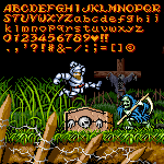
How about this
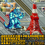
This is what the font would look like on an actual EAS screen.
In Schools, Teachers Know What is the 1st grade
DiH🥀
Can you fix your font
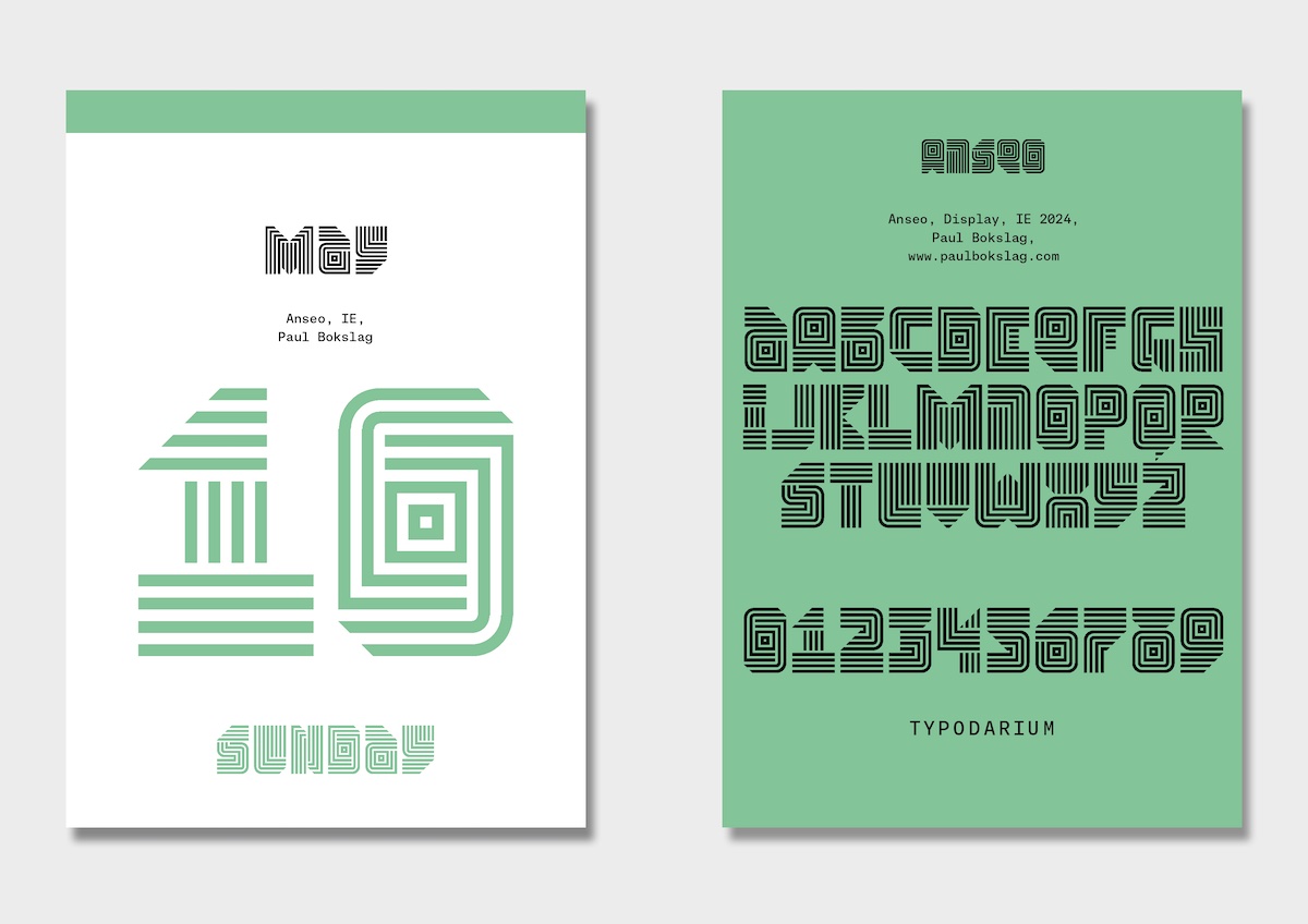
Digits 0-9 are o
Strong and consistent. The serifs in the top left corner are a nice touch.
Powerful contrast between heavy strokes and small counters. The kerning lifts it to the next level.
Beautiful curves, a wonderful piece of work!
yay new update
ngl i feel like u have a problem on saying peoples real names (not to be rude)
This looks similar to 9x5 Ultimate...
Where did you make it with?
yes
It seems the turn has table'd.
I am, 84
Yes.
Redesign the vulgar fractions 1/2; 1/4; 3/4 so that it is consistent with the other vulgar fractions (in the number forms block) PLEASE.
@avianity gigantic grids
@athemwulf ngl that looks more accurate
*it sounds annoying to say something already said
can you please not say the description? it sounds annoying
*Sorry: "14" years...
@PoonCheeHim - Because EZMonoB was released 15 years before Yapari (2008 versus 2022), it would be far more accurate to say that Yapari looks like this...
Looks like Yapari
UroLueLyeLueDUL
Dude, how do ya'll make such detailed fonts on here?! :D
i re create this font and publish it on my ko-fi :) hope u like it!
Furthermore you can check the FAQ page to read more