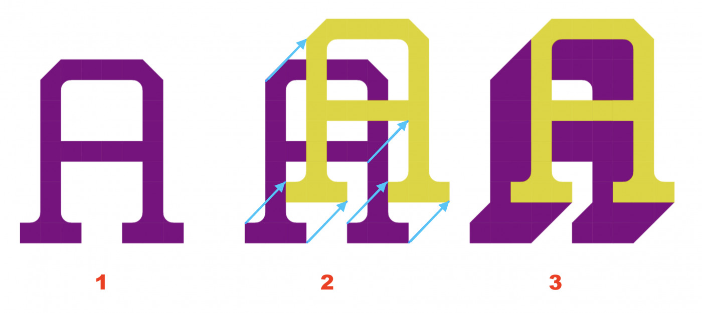
Without intending to delve deeper into the controversy, and simply in case it is useful to the author, this is how I think the shadows of this font should appear.
@TH3_C0N-MAN those tiny flicks were actually just because of the
limitations of the grid, and it wasn't intentional! initially i
thought those were flaws and i was like "whatever no one would
notice" but now i'm starting to like them actually
@thalamic: Thank you for joining. This is an open and public
discussion; there is no need for apology. You've made a very good
point by separating the two






.png)


Very good!
»