@Frodo: Hehe – no way!
What a useless git.
@beate: Troll votes are like a badge of honour. They never troll mediocre fonts. Don't let them steal your creative spirit.
Well, that was to be expected. Same as always. ; )
A lovely experiment! A little hard to read in some places, (the “Y” in particular is quite confusing) but with such a small grid, it’s more than forgivable. Fun samples, too.
10/10
Remove the Ojála (O is correct) change to <~>` characters.
Added Polish
Added Basic Latin
This is very art-deco to me, I dig this style a lot!


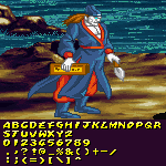


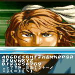


.png)


@Frodo: Hehe – no way!
»