i think goatmeal already explained it, but it's because he doesn't want his fonts to get reuploaded in fonts that say "1001 free fonts!!!11!!!!" without his credit
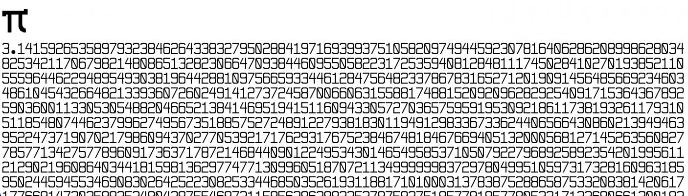
@Lasalle Lancers: I'm sorry to tell you, the leading is so terrible that it renders the font completely useless. The lines are too far apart. Since you left so much vertical space, why don't you give the letters proper descenders?







@ctcg_ after i do arrows and braille patterns
also i remember once doing a ffont for latin extended-b and that's just a hellish jungle
»