@Patrick H. Lauke (redux) - Thank you for this one. I know the font design is quite "standard," but the colors used for the font really make it "pop" for me. :^)
Plus, it's interesting that the ? ! are solid colors!
@opipik: Thank you for your comment. This work is far from settled. I'll consider your suggestion for the zero.
decided to skip to nko, not sure what block(s) to do next
I love this
this is clearly based off of the minecraft font, if not exactly the same. please rename
do you really write your Is like that?
there is now over one thousand, 1194 to be exact
why are people downloading this
This is absolutely great! The 0 might however benefit from a "curve" similar to the 9.


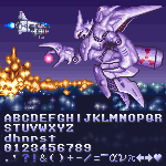
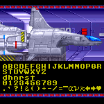


@Patrick H. Lauke (redux) - Thank you for this one. I know the font design is quite "standard," but the colors used for the font really make it "pop" for me. :^)
Plus, it's interesting that the ? ! are solid colors!
»