wait you used all combinations of 1 upper diacritic mixed with 1 lower diacritic with A
That's just number 13
np, thx for changing
btw I used your font name
I like this font
Great improvements, Maestro.
@Luuk Mölders: Thank you very much, glad you like it!
Spam Alert!
request: latin extended-F
@NewCurvenBig it never happened
Speaking of papers, CIPD assignments in uk a brings just for you as our writers have pulled together some great services spanning across cipd
Cyrillic glyphs are fantastic! But letters Ц, Ш and Щ should be look more like upside down letter П
I planned to add more Cyrillic glyphs, but yeah, this font supports only Russian
This font only supports Russian?
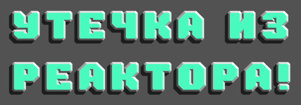
Update: The font SONiC Act No.1 now has support for Cyrillic letters!
Visit here: SONiC Act No.1 | FontStruct
Hi,
In everyday life, that could mean budgeting apps, scheduling planners, measurement calculators, or quick reference resources. In education, for example, a straightforward grade calculator can function as a powerful tool
Wow! Nice work. Very creative! 10/10
Wonder why you're interested in "The Upper FontStruct...
But 2101 would be, for example, "twenty one hundred one," doesn't work
You don't know how to make HD diagonal lines?
Ạ̧̃̌Ạ̃̌Ǎ̧̨̆Ạ̧̌̃̆Ạ̧̃̌Ạ̧̃Ą̧̌̆Ặ̧̌Ạ̣̃̆Ạ̧̃̌Ǎ̧̨̆́Ą̨̣̌̃̆Ạ̧̃̌Ạ̃̌Ǎ̧̨̆Ạ̧̌̃̆Ạ̧̃̌Ạ̧̃Ą̧̌̆Ặ̧̌Ạ̣̃̆Ạ̧̃̌Ǎ̧̨̆́Ą̨̣̌̃̆Ạ̧̃̌Ạ̃̌Ǎ̧̨̆Ạ̧̌̃̆Ạ̧̃̌Ạ̧̃Ą̧̌̆Ặ̧̌Ạ̣̃̆Ạ̧̃̌Ǎ̧̨̆́Ą̨̣̌̃̆Ạ̧̃̌Ạ̃̌Ǎ̧̨̆Ạ̧̌̃̆Ạ̧̃̌Ạ̧̃Ą̧̌̆Ặ̧̌Ạ̣̃̆Ạ̧̃̌Ǎ̧̨̆́Ą̨̣̌̃̆Ạ̧̃̌Ạ̃̌Ǎ̧̨̆Ạ̧̌̃̆Ạ̧̃̌Ạ̧̃Ą̧̌̆Ặ̧̌Ạ̣̃̆Ạ̧̃̌Ǎ̧̨̆́Ą̨̣̌̃̆Ạ̧̃̌Ạ̃̌Ǎ̧̨̆Ạ̧̌̃̆Ạ̧̃̌Ạ̧̃Ą̧̌̆Ặ̧̌Ạ̣̃̆Ạ̧̃̌Ǎ̧̨̆́Ą̨̣̌̃̆Ạ̧̃̌Ạ̃̌Ǎ̧̨̆Ạ̧̌̃̆Ạ̧̃̌Ạ̧̃Ą̧̌̆Ặ̧̌Ạ̣̃̆Ạ̧̃̌Ǎ̧̨̆́Ą̨̣̌̃̆Ạ̧̃̌Ạ̃̌Ǎ̧̨̆Ạ̧̌̃̆Ạ̧̃̌Ạ̧̃Ą̧̌̆Ặ̧̌Ạ̣̃̆Ạ̧̃̌Ǎ̧̨̆́Ą̨̣̌̃̆Ạ̧̃̌Ạ̃̌Ǎ̧̨̆Ạ̧̌̃̆Ạ̧̃̌Ạ̧̃Ą̧̌̆Ặ̧̌Ạ̣̃̆Ạ̧̃̌Ǎ̧̨̆́Ą̨̣̌̃̆Ạ̧̃̌Ạ̃̌Ǎ̧̨̆Ạ̧̌̃̆Ạ̧̃̌Ạ̧̃Ą̧̌̆Ặ̧̌Ạ̣̃̆Ạ̧̃̌Ǎ̧̨̆́Ą̨̣̌̃̆Ạ̧̃̌Ạ̃̌Ǎ̧̨̆Ạ̧̌̃̆Ạ̧̃̌Ạ̧̃Ą̧̌̆Ặ̧̌Ạ̣̃̆Ạ̧̃̌Ǎ̧̨̆́Ą̨̣̌̃̆Ạ̧̃̌Ạ̃̌Ǎ̧̨̆Ạ̧̌̃̆Ạ̧̃̌Ạ̧̃Ą̧̌̆Ặ̧̌Ạ̣̃̆Ạ̧̃̌Ǎ̧̨̆́Ą̨̣̌̃̆Ạ̧̃̌Ạ̃̌Ǎ̧̨̆Ạ̧̌̃̆Ạ̧̃̌Ạ̧̃Ą̧̌̆Ặ̧̌Ạ̣̃̆Ạ̧̃̌Ǎ̧̨̆́Ą̨̣̌̃̆Ạ̧̃̌Ạ̃̌Ǎ̧̨̆Ạ̧̌̃̆Ạ̧̃̌Ạ̧̃Ą̧̌̆Ặ̧̌Ạ̣̃̆Ạ̧̃̌Ǎ̧̨̆́Ą̨̣̌̃̆Ạ̧̃̌Ạ̃̌Ǎ̧̨̆Ạ̧̌̃̆Ạ̧̃̌Ạ̧̃Ą̧̌̆Ặ̧̌Ạ̣̃̆Ạ̧̃̌Ǎ̧̨̆́Ą̨̣̌̃̆Ạ̧̃̌Ạ̃̌Ǎ̧̨̆Ạ̧̌̃̆Ạ̧̃̌Ạ̧̃Ą̧̌̆Ặ̧̌Ạ̣̃̆Ạ̧̃̌Ǎ̧̨̆́Ą̨̣̌̃̆Ạ̧̃̌Ạ̃̌Ǎ̧̨̆Ạ̧̌̃̆Ạ̧̃̌Ạ̧̃Ą̧̌̆Ặ̧̌Ạ̣̃̆Ạ̧̃̌Ǎ̧̨̆́Ą̨̣̌̃̆Ạ̧̃̌Ạ̃̌Ǎ̧̨̆Ạ̧̌̃̆Ạ̧̃̌Ạ̧̃Ą̧̌̆Ặ̧̌Ạ̣̃̆Ạ̧̃̌Ǎ̧̨̆́Ą̨̣̌̃̆
*I am not your past self*
Number 0 is just nothing, Number 1 is (一) 十 百 etc.
I think you mistakenly pressed Shift+J and locked your guides. Width belongs to them.
Hello, does anyone know why (on some of my fonts) i can't edit letter width? did I press something or is it a glitch?
oh i probably miscounted as the background colour is the same as the W/SW/S shading colour
Please change it more, as only one glyph changed is not sufficient.
I consider this as minimally altered.
I agree. I've so far been unable to find an adequate simple slope without changing the width:height ratio (the closest I've been able to find
Add 3,000 more CJK Unified Ideographs! And make sure to split into 6 fonts (Plane 0, Plane1, Plane2, Plane3, PlaneF, Plane10)
actually, it can type almost any 4-digit year number
Update: A white-colour layer has been added for the North-East faces. Basic Cyrillic support.
@Kder how did it became popular?
Reminds me of Dexters Laboratory
Okay, I will private it, I guess. Thanks for experience, AskGamerViennaBinders



wait you used all combinations of 1 upper diacritic mixed with 1 lower diacritic with A
»