@18man that would be difficult, as the composite bounding box must be either 4x4 (2x4) or 8x2 (4x2) for two letters per composite
@18man - I assume "(not full)" means that it does not contain a complete character set that may be found elsewhere. If so, was it really necessary
PRotoN NQaLF should be the name because [n] is the NG character
wat is that image
it's simple logic
(not full)
noice
also in the chart, rows 1-3 have too much space between the elements, so here's a correctly spaced table:
H h Lb
@elliqvl why not also make composite for 2 letters in one brick, making the maximum 18, more than enough space to fit even rutherfordium
Bruh
yes you did, because the whole point of the font is the double, and there's only 1 [1] on [1], therefore making it worse
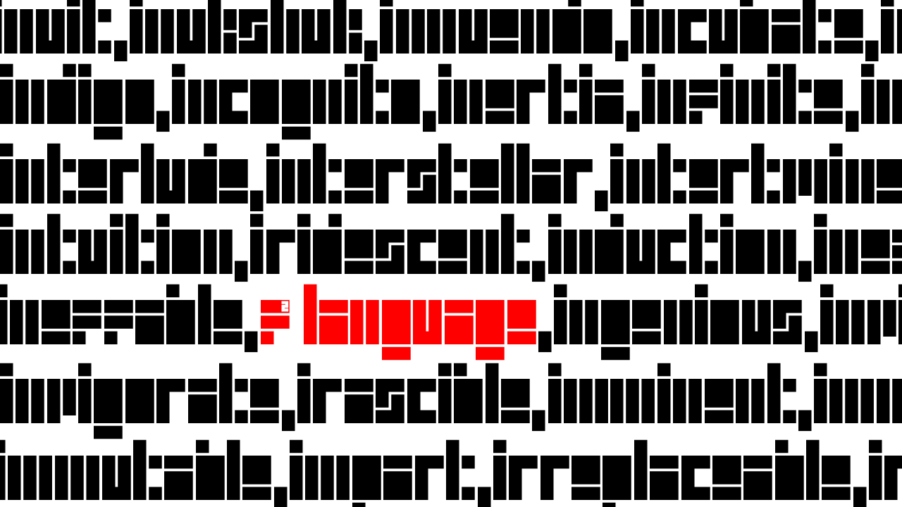
Minimalist typeface with blocky elements. I think the text is not legible, but the reader may be able to decipher it. Letters like the c, i, l, r, and u are OK. However, the a, e, m, n, w (and more) are too
Hmm, looks like the FONTSTRUCT logo. hmmm *smacks lips*
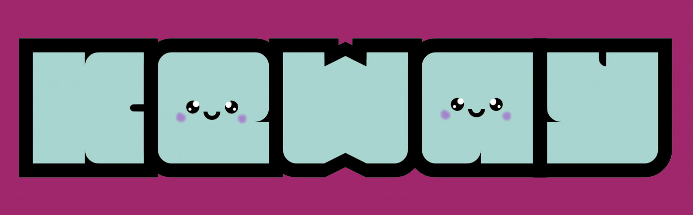
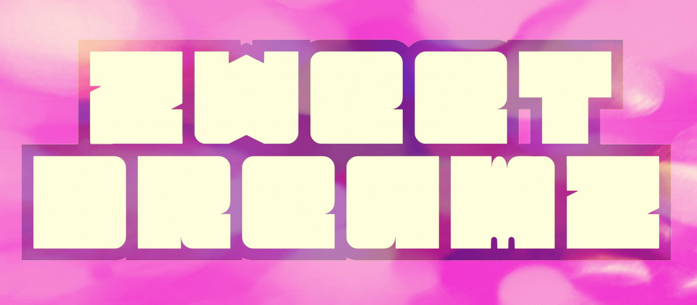
Nice Samples! Very cute...
Neat, a vietnamese version with Latin extended and IPA support
I totally agree with Frodo7 and I 100% support his comment!
Fascinating fractalization!
Exactly, but this is one of many Shanzai designs.
Hello, Antrotherkus. I am Jeyco with a foundry, i don't know if you still reminding me...
It is not nice to litter someone's font page with nonsense comments. This is an exemplary work of the highest quality. Well-documented and beautifully
Multi-scale Truchet tiling.
new update coming soon
It's not warning is disclaimer.
No more glyphs? You last edit was in 4 days (Monday 23rd March).
Can you also provide Unicode mappings for these characters?







@18man that would be difficult, as the composite bounding box must be either 4x4 (2x4) or 8x2 (4x2) for two letters per composite
»