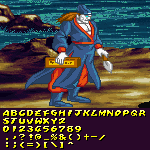
@Gr4ftY @Luca: Perhaps this would make it easier to understand what I meant. But of course @beate these are just fun suggestions. The world is your oyster!
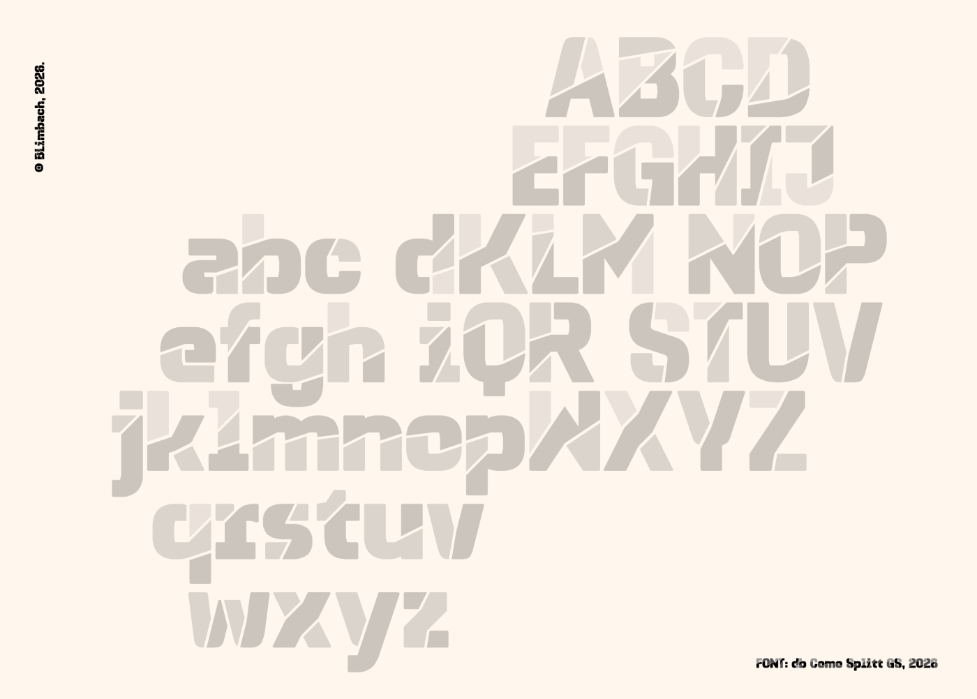
Interesting variation on your Como family. I can foresee the splits being used in other ways, like pizza slices, stained glass, or cardboard cutouts. (✯ᴗ✯)
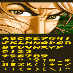
By the way, I just updated my Kevin Mono font by adding Latin Exteneded-A glyphs. I suggest you to increase the X-Height (aka. the lowercase letter heights) by just 1 pixel, just like what I did in my own Kevin Mono font.
A lovely experiment! A little hard to read in some places, (the “Y” in particular is quite confusing) but with such a small grid, it’s more than forgivable. Fun samples, too.



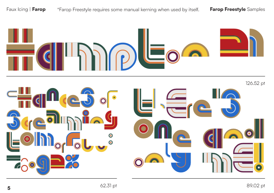


Cool concept, but this is actually a 6 segment display.
»