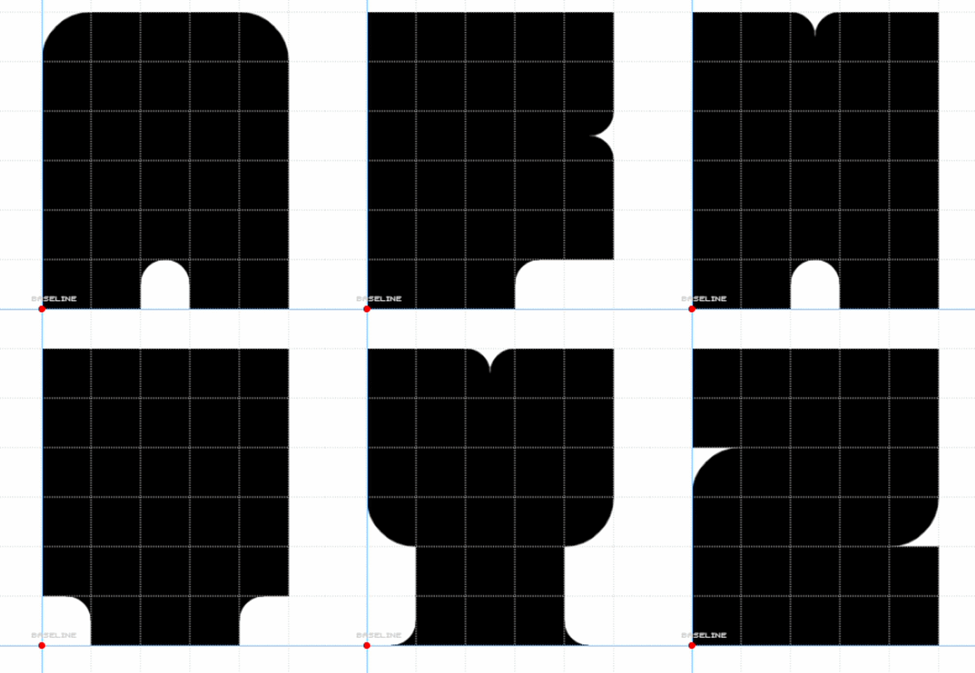
Like the previous comment said, it isn't really a "monospaced" font—some characters, especially the letter M and the numeral 1, are either shorter or longer in length. Nice attempt, though!
@XLS2009 (Win Products): I very much like your works. They are
precise, consistent, and of high quality. The originality of pixel
fonts, especially at small
Just like I said, I'm have a new strategy to improve fonts apart
from just using FontStruct. I'm will make some proportional or
monospaced font remakes
Unortunately, I'm not sure winch Latin glyphs was used. If you see rare glyphs being used, just don't be minded. You just need to at least being liked at the font, and everyone have their own choice and decision of their own font.
Tomorrow, I will extended the Bayu Console and Annisa Console font to support Latin Extended Additional glyphs. Also, my unpulished and deleted fonts like Karina Console and Martin Mono with be re-maked in future.
If you guys wondering about Monixend Deca, Exa, and Giga. I've been unpulished it and removed that font due to few factors, same as my few other fonts like Karina Console and Martin Mono font.







.png)


400 characters
»