Congrats on the TP! I agree with Master Frodo7 regarding the opinions and improvements he mentioned for the font. Personally, I greatly value his explanations and suggestions, which have always improved my work.
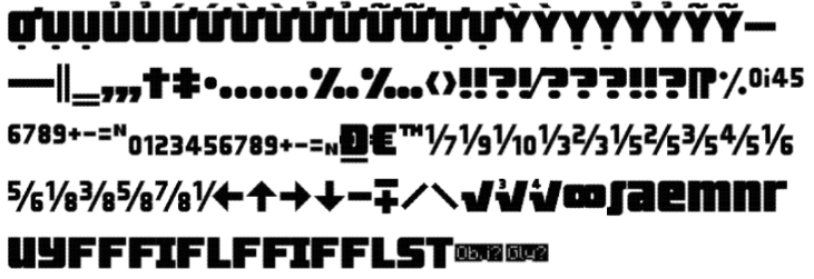
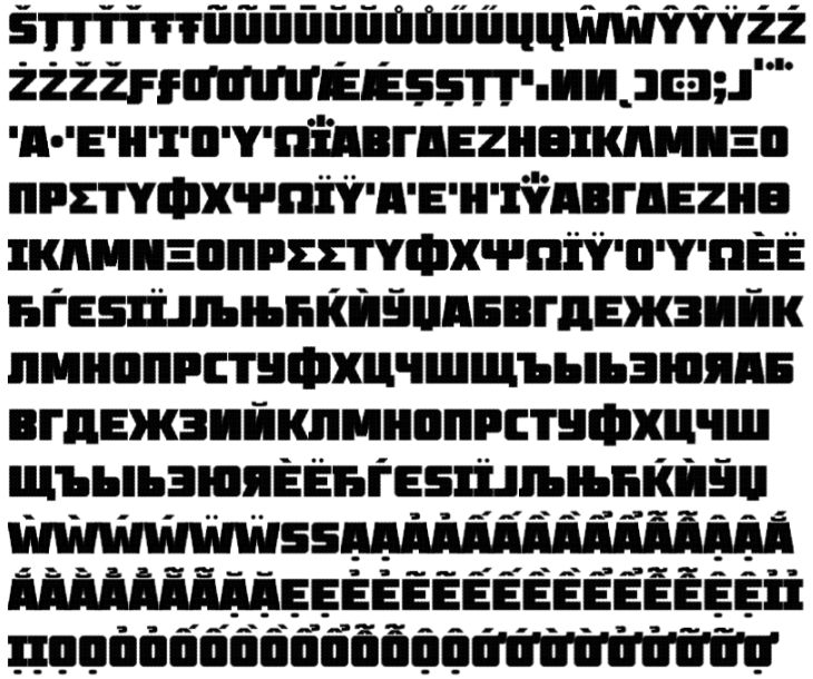
A heavy sans-serif all-caps font, with robust language support;
quite a big endeavour. I have several suggestions for
improving this work.
Latin set
The letters and numbers look OK with a few exceptions. The
capital I doesn't need serifs. It seems odd in this font design.
Number 4 looks narrower than the others. This font is not
monospaced; you have the liberty to make it wider.
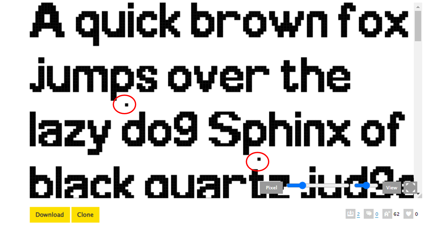
The comma and the period don't match. Rounded or rectangular,
they should share the same design.
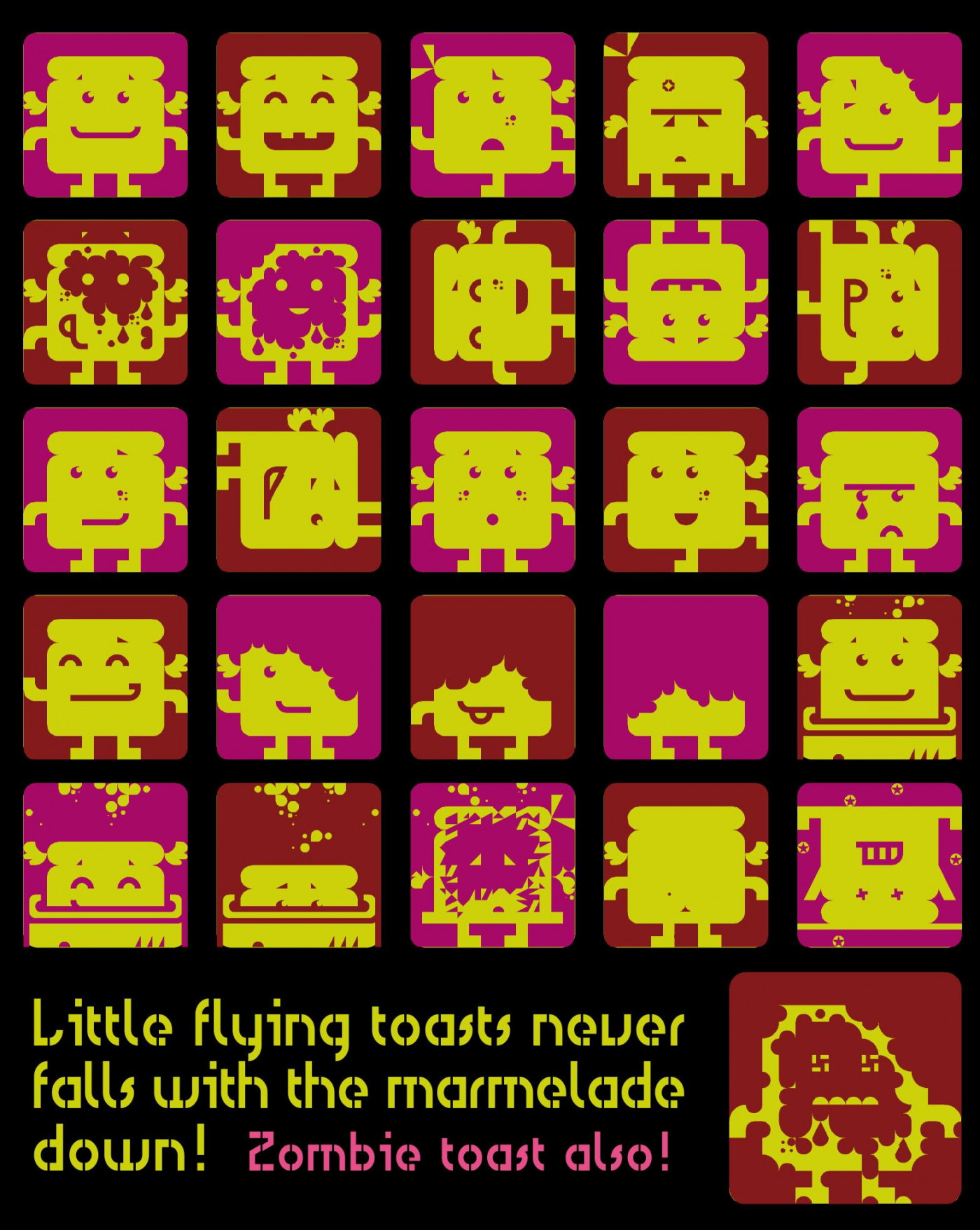
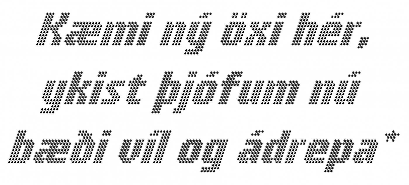
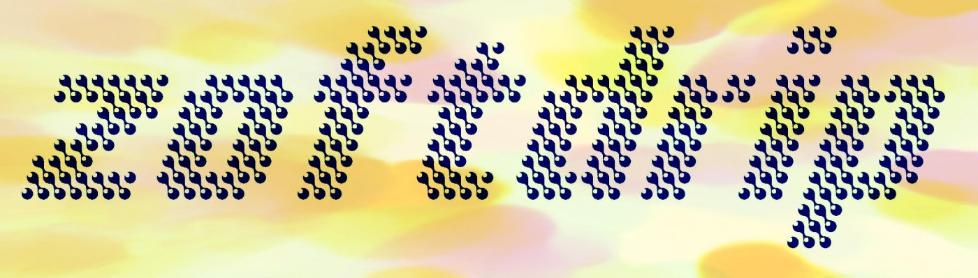
Here's a sample of my font with a short paragraph I wrote. I created this image using PowerPoint. Additionally, this image contains unicase characters from a "Private Use Area" block of this font.










@meek: Thanks a million, BigChief!
»