@Patrick H. Lauke (redux) - Another great font, but the 4 is lacking here, too. They SHOULD have made the left vertical as a slight diagonal for a distinct little flair, like on the stem of the 7.
Very nice hand-drawn letters. The text is well-balanced and pleasant to read. It needs kerning here and there. Did you do it with a pen and tablet? 10/10


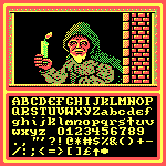


@Patrick H. Lauke (redux) - Another great font, but the 4 is lacking here, too. They SHOULD have made the left vertical as a slight diagonal for a distinct little flair, like on the stem of the 7.
»