@Frodo7 @Goatmeal, I tried fixing the angles of the M in my State font. I can clearly see the difference using the tutorial that was provided. I am very happy with the result.
@Frodo7 I always wondered why the angels were too thin or too
thick. I thought it was because of the bricks themselves and
how they are placed. Before constructing a new font, I use a
graph composition book to


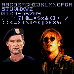


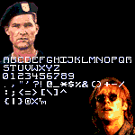




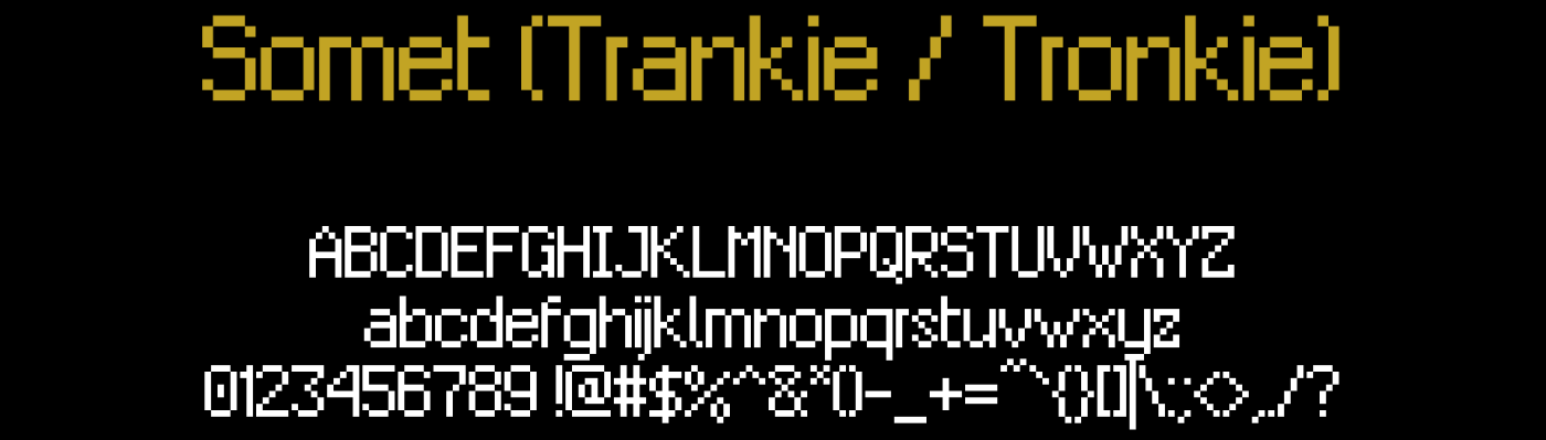

EuroOne has changed!
Yes, I just replaced the K's shape to a more reasonnable “pro” like font than before.
»