Totally, Lvqille.
Wow! I never seen this! Also i'm Jeyco with a foundry. I don't know if you see my comment in Ricecake.
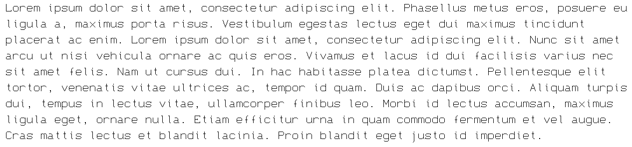
"Each character is 9x16px, and the font is best rendered at a size of 13px."
Due to the "4 px:3 pt" scaling ratio on Windows, it is best done at multiples of 10.5 pt.
Sample Text
i don't understand anything here
@fruptile i don't get what's going on either "\_(._.)_/"
@18man what am i saying
@ingifn you are wrong, it's spelled like that on purpose
why did you comment "completed more latin section" twice?
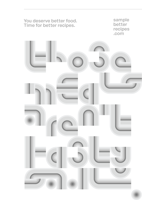
@faux_icing - A very interesting effect. I've always been a fan of gradients! :^)
May 2 2026:
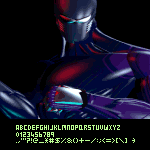
Completed More Latin section.
Added Greek Alphabet and other stuff.
Good point @Goatmeal.
Good font! Although you should remove the tittles of the accented lowercase i's.
ngl i agree with @dpla
cool ffont
One word to describe this: awesome
.ttf files can also have GSUB/GPOS tables inside them. (I have made fonts outside of FontStruct as TrueType, and yet they have GSUB tables)
May 1, 2026:
Created font, completed Basic Latin section.
Note that this font does not display properly with OpenType format (TrueType format recommended) .








Totally, Lvqille.
»