

Browse and find FontStructions
Display
Any License
- Any License
- Commercial Use
- Downloadable
- Cloneable
- All Rights Reserved
- Creative Commons Attribution Non-commercial No Derivatives
- Creative Commons Attribution Non-commercial Share Alike
- Creative Commons Attribution Non-commercial
- Creative Commons Attribution No Derivatives
- Creative Commons Attribution Share Alike
- Creative Commons Attribution
- FontStruct Non-Commercial License
- FontStruct License
- Creative Commons CC0 Public Domain Dedication
- Open Font License
Sort: Sharing Date
Show:
- Staff Picks (3290)
- All (5605)
BLOKO
by Axel Leyer6.08
Click on the stars to rate this FontStruction.
Balanced Rating: 6.08
Average Rating: 5.13
Click for more information about this rating. 8 votes You voted ? for this FontStruction. You may change your vote at any time.
Balanced Rating: 6.08
Average Rating: 5.13
Click for more information about this rating. 8 votes You voted ? for this FontStruction. You may change your vote at any time.

Jigsaw 2
by bryndlefly7.61
Click on the stars to rate this FontStruction.
Balanced Rating: 7.61
Average Rating: 7.53
Click for more information about this rating. 15 votes You voted ? for this FontStruction. You may change your vote at any time.
Balanced Rating: 7.61
Average Rating: 7.53
Click for more information about this rating. 15 votes You voted ? for this FontStruction. You may change your vote at any time.
1224829
Published: 10th June, 2008
Last edited: 16th June, 2009
Created: 10th June, 2008
Jigsaw puzzle pieces. Note: The point size seems tiny when downloaded, not sure why. If you use the underscore character as a space, and adjust the tracking and leading the pieces should fit together horizontally and vertically.
Last edited: 16th June, 2009
Created: 10th June, 2008
Jigsaw puzzle pieces. Note: The point size seems tiny when downloaded, not sure why. If you use the underscore character as a space, and adjust the tracking and leading the pieces should fit together horizontally and vertically.
The L
by jacknchicken7.10
Click on the stars to rate this FontStruction.
Balanced Rating: 7.10
Average Rating: 6.88
Click for more information about this rating. 15 votes You voted ? for this FontStruction. You may change your vote at any time.
Balanced Rating: 7.10
Average Rating: 6.88
Click for more information about this rating. 15 votes You voted ? for this FontStruction. You may change your vote at any time.
Chromatose
by LexKominek7.10
Click on the stars to rate this FontStruction.
Balanced Rating: 7.10
Average Rating: 6.85
Click for more information about this rating. 13 votes You voted ? for this FontStruction. You may change your vote at any time.
Balanced Rating: 7.10
Average Rating: 6.85
Click for more information about this rating. 13 votes You voted ? for this FontStruction. You may change your vote at any time.
1285766
Published: 10th June, 2008
Last edited: 15th June, 2009
Created: 10th June, 2008
A beveled font that has a mid-20th-century vibe to it. Layer the upper and lower cases in different colours. Upper case is highlight, lower case is shadow. Numbers are shadow, their corresponding punctuation is highlight. Period and comma go with colon and semicolon. UPDATED 25 February 2009: Fixed spacing on X, Y, and 7 so lowercase and uppercase line up.
Faceplate Bold
by LadyKilla6.78
Click on the stars to rate this FontStruction.
Balanced Rating: 6.78
Average Rating: 6.00
Click for more information about this rating. 6 votes You voted ? for this FontStruction. You may change your vote at any time.
Balanced Rating: 6.78
Average Rating: 6.00
Click for more information about this rating. 6 votes You voted ? for this FontStruction. You may change your vote at any time.
FS ZIG'N'ZAG
by Tylo8.27
Click on the stars to rate this FontStruction.
Balanced Rating: 8.27
Average Rating: 8.50
Click for more information about this rating. 7 votes You voted ? for this FontStruction. You may change your vote at any time.
Balanced Rating: 8.27
Average Rating: 8.50
Click for more information about this rating. 7 votes You voted ? for this FontStruction. You may change your vote at any time.
HAUS Small Caps
by guentersen8.10
Click on the stars to rate this FontStruction.
Balanced Rating: 8.10
Average Rating: 8.14
Click for more information about this rating. 21 votes You voted ? for this FontStruction. You may change your vote at any time.
Balanced Rating: 8.10
Average Rating: 8.14
Click for more information about this rating. 21 votes You voted ? for this FontStruction. You may change your vote at any time.
4232313322
Published: 10th June, 2008
Last edited: 13th March, 2024
Created: 10th June, 2008
a univers-like font inspired by the posters for the "haus der kunst" in munich. there's a "real™ font" called PUNKT™ that i discovered after re-designing this one in the linotype-library. PUNKT™ features lowercase only, numbers, punctation, some additional characters AND professional kerning! HAUS is a RE-DESIGN and differs in some glyphs from PUNKT™. I completed the set with small caps and small digits and developed text numbers. There are also some alternates and some "ligatures" to improve the metrics without kerning (use 'find and replace') enjoy!This is a clone of HAUS
Origamistic
by deshzx8.52
Click on the stars to rate this FontStruction.
Balanced Rating: 8.52
Average Rating: 8.59
Click for more information about this rating. 39 votes You voted ? for this FontStruction. You may change your vote at any time.
Balanced Rating: 8.52
Average Rating: 8.59
Click for more information about this rating. 39 votes You voted ? for this FontStruction. You may change your vote at any time.
Picchu
by sbrunoj7.32
Click on the stars to rate this FontStruction.
Balanced Rating: 7.32
Average Rating: 7.18
Click for more information about this rating. 17 votes You voted ? for this FontStruction. You may change your vote at any time.
Balanced Rating: 7.32
Average Rating: 7.18
Click for more information about this rating. 17 votes You voted ? for this FontStruction. You may change your vote at any time.
Myrdle Condensed
by sbrunoj6.62
Click on the stars to rate this FontStruction.
Balanced Rating: 6.62
Average Rating: 5.86
Click for more information about this rating. 7 votes You voted ? for this FontStruction. You may change your vote at any time.
Balanced Rating: 6.62
Average Rating: 5.86
Click for more information about this rating. 7 votes You voted ? for this FontStruction. You may change your vote at any time.
anotheronebis
by woutery6.28
Click on the stars to rate this FontStruction.
Balanced Rating: 6.28
Average Rating: 5.60
Click for more information about this rating. 10 votes You voted ? for this FontStruction. You may change your vote at any time.
Balanced Rating: 6.28
Average Rating: 5.60
Click for more information about this rating. 10 votes You voted ? for this FontStruction. You may change your vote at any time.
8402173
Published: 9th June, 2008
Last edited: 24th July, 2008
Created: 9th June, 2008
Clone of anotherone.This is a clone of anotherone
Last edited: 24th July, 2008
Created: 9th June, 2008
Clone of anotherone.This is a clone of anotherone
saratogajean
by saratogajean8.17
Click on the stars to rate this FontStruction.
Balanced Rating: 8.17
Average Rating: 8.20
Click for more information about this rating. 51 votes You voted ? for this FontStruction. You may change your vote at any time.
Balanced Rating: 8.17
Average Rating: 8.20
Click for more information about this rating. 51 votes You voted ? for this FontStruction. You may change your vote at any time.
De Stijl
by nnnick7777.14
Click on the stars to rate this FontStruction.
Balanced Rating: 7.14
Average Rating: 6.75
Click for more information about this rating. 8 votes You voted ? for this FontStruction. You may change your vote at any time.
Balanced Rating: 7.14
Average Rating: 6.75
Click for more information about this rating. 8 votes You voted ? for this FontStruction. You may change your vote at any time.
LambChop Skinny
by chough6.72
Click on the stars to rate this FontStruction.
Balanced Rating: 6.72
Average Rating: 6.27
Click for more information about this rating. 11 votes You voted ? for this FontStruction. You may change your vote at any time.
Balanced Rating: 6.72
Average Rating: 6.27
Click for more information about this rating. 11 votes You voted ? for this FontStruction. You may change your vote at any time.
490881
Published: 9th June, 2008
Last edited: 16th June, 2009
Created: 9th June, 2008
Slimline version of LambChop Series II. Don't judge too harshly, work in progress! Comments and suggestions welcome.This is a clone of LambChop Series II
Last edited: 16th June, 2009
Created: 9th June, 2008
Slimline version of LambChop Series II. Don't judge too harshly, work in progress! Comments and suggestions welcome.This is a clone of LambChop Series II
Bee Legacy
by Em427.45
Click on the stars to rate this FontStruction.
Balanced Rating: 7.45
Average Rating: 7.36
Click for more information about this rating. 22 votes You voted ? for this FontStruction. You may change your vote at any time.
Balanced Rating: 7.45
Average Rating: 7.36
Click for more information about this rating. 22 votes You voted ? for this FontStruction. You may change your vote at any time.
288116618
Published: 8th June, 2008
Last edited: 30th July, 2009
Created: 8th June, 2008
Built inside hexagonal shapes. Lowercase are bee-related freemasonry-like symbols.
Special characters are the following:
. is for a full cell;
, is for a single-border cell;>
_ is for an double-border cell;
+ is for an empty space (FontStruct preview only);
- is for half empty space (FontStruct preview only).
See the font in use here.
Fontstructed before the latest diagonal bricks addition.
HulkSmash
by geneus18.75
Click on the stars to rate this FontStruction.
Balanced Rating: 8.75
Average Rating: 8.77
Click for more information about this rating. 163 votes You voted ? for this FontStruction. You may change your vote at any time.
Balanced Rating: 8.75
Average Rating: 8.77
Click for more information about this rating. 163 votes You voted ? for this FontStruction. You may change your vote at any time.
Stackt
by LadyKilla6.93
Click on the stars to rate this FontStruction.
Balanced Rating: 6.93
Average Rating: 6.43
Click for more information about this rating. 8 votes You voted ? for this FontStruction. You may change your vote at any time.
Balanced Rating: 6.93
Average Rating: 6.43
Click for more information about this rating. 8 votes You voted ? for this FontStruction. You may change your vote at any time.
Scar
by Setsuna7.36
Click on the stars to rate this FontStruction.
Balanced Rating: 7.36
Average Rating: 7.00
Click for more information about this rating. 6 votes You voted ? for this FontStruction. You may change your vote at any time.
Balanced Rating: 7.36
Average Rating: 7.00
Click for more information about this rating. 6 votes You voted ? for this FontStruction. You may change your vote at any time.
Fraktured Bubbles
by tsampson6.14
Click on the stars to rate this FontStruction.
Balanced Rating: 6.14
Average Rating: 5.69
Click for more information about this rating. 16 votes You voted ? for this FontStruction. You may change your vote at any time.
Balanced Rating: 6.14
Average Rating: 5.69
Click for more information about this rating. 16 votes You voted ? for this FontStruction. You may change your vote at any time.
15 Square
by 15shapes6.12
Click on the stars to rate this FontStruction.
Balanced Rating: 6.12
Average Rating: 5.50
Click for more information about this rating. 12 votes You voted ? for this FontStruction. You may change your vote at any time.
Balanced Rating: 6.12
Average Rating: 5.50
Click for more information about this rating. 12 votes You voted ? for this FontStruction. You may change your vote at any time.
no15a
by 15shapes5.99
Click on the stars to rate this FontStruction.
Balanced Rating: 5.99
Average Rating: 5.11
Click for more information about this rating. 9 votes You voted ? for this FontStruction. You may change your vote at any time.
Balanced Rating: 5.99
Average Rating: 5.11
Click for more information about this rating. 9 votes You voted ? for this FontStruction. You may change your vote at any time.
POSTCODE
by nitrada7.55
Click on the stars to rate this FontStruction.
Balanced Rating: 7.55
Average Rating: 7.50
Click for more information about this rating. 26 votes You voted ? for this FontStruction. You may change your vote at any time.
Balanced Rating: 7.55
Average Rating: 7.50
Click for more information about this rating. 26 votes You voted ? for this FontStruction. You may change your vote at any time.
271158713
Published: 6th June, 2008
Last edited: 4th January, 2009
Created: 6th June, 2008
This is still work in progress, a lot of characters missing. There are only UPPERCASE characters available, I filled the lowercase letters with random symbols/patterns. The design is based on this stamp design from 1978 by Gert Dumbar. Use font sizes 64, 128 or 256px. Set leading to 24 (for font size 64), 48 (for 128) and 96 (for 256). More information
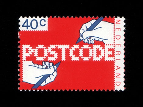
BlocParty Outline
by garphynk6.06
Click on the stars to rate this FontStruction.
Balanced Rating: 6.06
Average Rating: 5.42
Click for more information about this rating. 12 votes You voted ? for this FontStruction. You may change your vote at any time.
Balanced Rating: 6.06
Average Rating: 5.42
Click for more information about this rating. 12 votes You voted ? for this FontStruction. You may change your vote at any time.
Flim
by Karras6.46
Click on the stars to rate this FontStruction.
Balanced Rating: 6.46
Average Rating: 6.07
Click for more information about this rating. 15 votes You voted ? for this FontStruction. You may change your vote at any time.
Balanced Rating: 6.46
Average Rating: 6.07
Click for more information about this rating. 15 votes You voted ? for this FontStruction. You may change your vote at any time.
SpaceLab
by gspace6.71
Click on the stars to rate this FontStruction.
Balanced Rating: 6.71
Average Rating: 6.00
Click for more information about this rating. 7 votes You voted ? for this FontStruction. You may change your vote at any time.
Balanced Rating: 6.71
Average Rating: 6.00
Click for more information about this rating. 7 votes You voted ? for this FontStruction. You may change your vote at any time.
Quint City
by nemoorange7.69
Click on the stars to rate this FontStruction.
Balanced Rating: 7.69
Average Rating: 7.57
Click for more information about this rating. 7 votes You voted ? for this FontStruction. You may change your vote at any time.
Balanced Rating: 7.69
Average Rating: 7.57
Click for more information about this rating. 7 votes You voted ? for this FontStruction. You may change your vote at any time.
Wide Horizon
by alexfulton6.48
Click on the stars to rate this FontStruction.
Balanced Rating: 6.48
Average Rating: 5.50
Click for more information about this rating. 6 votes You voted ? for this FontStruction. You may change your vote at any time.
Balanced Rating: 6.48
Average Rating: 5.50
Click for more information about this rating. 6 votes You voted ? for this FontStruction. You may change your vote at any time.
Trixel Square Shadow NW
by julischka6.53
Click on the stars to rate this FontStruction.
Balanced Rating: 6.53
Average Rating: 6.25
Click for more information about this rating. 20 votes You voted ? for this FontStruction. You may change your vote at any time.
Balanced Rating: 6.53
Average Rating: 6.25
Click for more information about this rating. 20 votes You voted ? for this FontStruction. You may change your vote at any time.
BopCloser
by typerider6.77
Click on the stars to rate this FontStruction.
Balanced Rating: 6.77
Average Rating: 6.30
Click for more information about this rating. 10 votes You voted ? for this FontStruction. You may change your vote at any time.
Balanced Rating: 6.77
Average Rating: 6.30
Click for more information about this rating. 10 votes You voted ? for this FontStruction. You may change your vote at any time.
Siam
by Joe Fruchey (joefru)6.44
Click on the stars to rate this FontStruction.
Balanced Rating: 6.44
Average Rating: 6.20
Click for more information about this rating. 25 votes You voted ? for this FontStruction. You may change your vote at any time.
Balanced Rating: 6.44
Average Rating: 6.20
Click for more information about this rating. 25 votes You voted ? for this FontStruction. You may change your vote at any time.
Best before end
by alexfulton6.06
Click on the stars to rate this FontStruction.
Balanced Rating: 6.06
Average Rating: 5.36
Click for more information about this rating. 11 votes You voted ? for this FontStruction. You may change your vote at any time.
Balanced Rating: 6.06
Average Rating: 5.36
Click for more information about this rating. 11 votes You voted ? for this FontStruction. You may change your vote at any time.
Zeppa
by alexfulton6.65
Click on the stars to rate this FontStruction.
Balanced Rating: 6.65
Average Rating: 6.18
Click for more information about this rating. 11 votes You voted ? for this FontStruction. You may change your vote at any time.
Balanced Rating: 6.65
Average Rating: 6.18
Click for more information about this rating. 11 votes You voted ? for this FontStruction. You may change your vote at any time.