

Fontstructions tagged with “Display”
Searching for more “Display” fonts?
Buy and download “Display” fonts at MyFonts.
- Any License
- Commercial Use
- Downloadable
- Cloneable
- All Rights Reserved
- Creative Commons Attribution Non-commercial No Derivatives
- Creative Commons Attribution Non-commercial Share Alike
- Creative Commons Attribution Non-commercial
- Creative Commons Attribution No Derivatives
- Creative Commons Attribution Share Alike
- Creative Commons Attribution
- FontStruct Non-Commercial License
- FontStruct License
- Creative Commons CC0 Public Domain Dedication
- Open Font License
- Staff Picks (44)
- All (198)
AdiCup Q 2022
by caverasBalanced Rating: 8.76
Average Rating: 10.00
Click for more information about this rating. 3 votes You voted ? for this FontStruction. You may change your vote at any time.

Last edited: 5th April, 2022
Created: 6th December, 2021
Extended set based on an early preview of the rumored original Adidas World Cup Qatar 2022 font.
More information: https://www.footyheadlines.com/2021/12/adidas-2022-world-cup-kit-font-leaked.html
[Font might change a bit over time to give some characters a more fitting style.]
Only free for non-commercial use! If you wish to obtain a commercial license for one of my fonts, please contact me.
AdiCup Q 2022 font Copyright © Caveras
kaputt
by alziroBalanced Rating: 5.84
Average Rating: 5.56
Click for more information about this rating. 31 votes You voted ? for this FontStruction. You may change your vote at any time.
Djangogh 2x
by William Leverette (will.i.ૐ)Balanced Rating: 8.65
Average Rating: 8.69
Click for more information about this rating. 71 votes You voted ? for this FontStruction. You may change your vote at any time.
Pullchain
by dcsudweeksBalanced Rating: 7.92
Average Rating: 7.93
Click for more information about this rating. 29 votes You voted ? for this FontStruction. You may change your vote at any time.
Ohm Run Slab
by William Leverette (will.i.ૐ)Balanced Rating: 8.81
Average Rating: 8.89
Click for more information about this rating. 46 votes You voted ? for this FontStruction. You may change your vote at any time.
Last edited: 9th August, 2011
Created: 4th March, 2011
Here, the innovative approach I took to stroke contrast in iSlab takes a radical leap forward. The result: a technical, friendly, modern slab serif design demonstrating further potential of the stackable composite function.
Please enjoy a private clone to see how I dealt with contrast, curves, bracketing, variable letter width and the difficult-to-achieve emboldening of the capitals’ vertical strokes within a minimal fontstruct matrix (and If you like what you see, please download for personal usage and vote kindly! :)
Intaglio’s amazing recent work makes similar strides (see the excellent rounds, for example), offering a solution before me to several of these long-standing impasses of the medium.
More characters to come... :)
This is a clonefs Kronos
by William Leverette (will.i.ૐ)Balanced Rating: 8.63
Average Rating: 8.69
Click for more information about this rating. 50 votes You voted ? for this FontStruction. You may change your vote at any time.
Last edited: 18th October, 2019
Created: 25th January, 2011
filters: 2x2
x-height: 2.5 bricks
cap height: 3.5 bricks
# of unique composites: 220+
The ultra-low resolution of this grid may be difficult to grasp without cloning. Fontstruct’s logo has a nominal x-height of 3 bricks, by comparison.
The level of detail, control, and finesse possible in a given fonstruction depended mostly on resolution prior to the recent advent of stackable composites. Did you want it better? Make it bigger!
Brute force, now meet Elegance.
Instead of building individual glyphs hundreds of bricks tall, stackable composites allow us to design rich modular schemata hundreds of bricks deep. Using curved bricks at their largest scale, linear and curvilinear elements dynamically harmonize and oppose. As well, screen fonts can be effectively hinted (aside from notable lack of kerning controls) without sacrificing the integrity of joins and intersections. And the trapping possibilities, Oh the sweet sweet trapping possibilities...
Please, vote kindly and stay tuned for more :)
This is a cloneQwerty Revisited
by geniaalBalanced Rating: 6.10
Average Rating: 5.80
Click for more information about this rating. 25 votes You voted ? for this FontStruction. You may change your vote at any time.
Pullchain Bold
by dcsudweeksBalanced Rating: 7.73
Average Rating: 7.70
Click for more information about this rating. 20 votes You voted ? for this FontStruction. You may change your vote at any time.
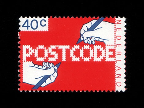
POSTCODE
by nitradaBalanced Rating: 7.55
Average Rating: 7.50
Click for more information about this rating. 26 votes You voted ? for this FontStruction. You may change your vote at any time.
Last edited: 4th January, 2009
Created: 6th June, 2008
This is still work in progress, a lot of characters missing. There are only UPPERCASE characters available, I filled the lowercase letters with random symbols/patterns. The design is based on this stamp design from 1978 by Gert Dumbar. Use font sizes 64, 128 or 256px. Set leading to 24 (for font size 64), 48 (for 128) and 96 (for 256). More information
Figaro
by IxelBalanced Rating: 6.94
Average Rating: 6.69
Click for more information about this rating. 16 votes You voted ? for this FontStruction. You may change your vote at any time.
Hectic Outline
by ellteeBalanced Rating: 6.85
Average Rating: 6.67
Click for more information about this rating. 24 votes You voted ? for this FontStruction. You may change your vote at any time.
Curved 16 Segment
by GoatmealBalanced Rating: 6.75
Average Rating: 6.22
Click for more information about this rating. 9 votes You voted ? for this FontStruction. You may change your vote at any time.
Last edited: 21st September, 2015
Created: 15th September, 2015
After looking at several examples, this is my interpretation of a 16 Segment alphabet, an expansion of my Curved Seven Segment experiment. Hopefully a little more elegant than the traditional "sharp-angled" versions. The interior diagonals are not as nice as I would like, but suitable for this project.
Curved Seven Segment 2
by GoatmealBalanced Rating: 7.92
Average Rating: 8.00
Click for more information about this rating. 2 votes You voted ? for this FontStruction. You may change your vote at any time.
Last edited: 13th September, 2015
Created: 13th September, 2015
Clone of Curved Seven Segment. A variant of my previous font: the lower left segment now matches the other three corners, allowing for a symmetrical design of hexdecimal letters. Again, inspired by the LCD numbers of my Casio calculator watch and the digital screens of modern gasoline pumps. Hopefully a little more elegant than the traditional "sharp-angled" versions. Limited to hexadecimal values (A-F, a-f, 0-9), the decimal point (period .), and the colon (:).This is a clone of Curved Seven Segment
Konstruct
by afrojetBalanced Rating: 7.22
Average Rating: 7.00
Click for more information about this rating. 13 votes You voted ? for this FontStruction. You may change your vote at any time.
Pop Drops
by afrojetBalanced Rating: 6.62
Average Rating: 6.27
Click for more information about this rating. 15 votes You voted ? for this FontStruction. You may change your vote at any time.
Last edited: 22nd June, 2009
Created: 1st July, 2008
Inspired by the saccharine sounds of the ice cream truck, which has been making the late evening loop around these parts. Upper and lowercase letters enjoy getting all mixed up with one other like a melting Neapolitan ice cream bar. Enjoy.This is a clone of Pop Blox
Summer Grillz
by afrojetBalanced Rating: 6.88
Average Rating: 6.60
Click for more information about this rating. 15 votes You voted ? for this FontStruction. You may change your vote at any time.
Last edited: 3rd November, 2008
Created: 24th June, 2008
More gangster than Gill with more gold than Garamond, Summer Grillz is type jewelry for your mouth. All letterforms are diamond-kut using the finest type constructing software on the market today. Customize your grill with different fills. For extra bling and total street-hustle krunk, layer the star fill on top of the base pave set. Color that s#it gold, son. Put your type where your mouth is. Note: kerning subject to da gaps yo teef.
Geodoni Extra Black Condensed
by William Leverette (will.i.ૐ)Balanced Rating: 8.46
Average Rating: 8.57
Click for more information about this rating. 23 votes You voted ? for this FontStruction. You may change your vote at any time.
Last edited: 27th June, 2011
Created: 13th February, 2011
filters: 2x2
x-height: 3 bricks (x2) = 6 grid spaces
cap, ascender height: 4 bricks, 8 grid spaces
Narrow and heavy, ultra bold Piano key designs once required fractional brick scaling to generate their distinctive slit-like counter forms while working with maximum curves. Composite stacks provide a more elegant and versatile solution to this old problem. In this way, they can be seen as an important milestone on the road toward individually scalable bricks...
Letterspacing is kept tight in this fontstruction, but still needs a great deal of manual kerning especially around all the character lacking serifs on one or both sides.
72+ initial downloads done during testing and troubleshooting. More characters to come. Enjoy, and please vote kindly. : )
This is a cloneDolores Alpha
by IxelBalanced Rating: 7.26
Average Rating: 7.16
Click for more information about this rating. 25 votes You voted ? for this FontStruction. You may change your vote at any time.
AT Quba
by kassymkulovBalanced Rating: 8.78
Average Rating: 9.00
Click for more information about this rating. 17 votes You voted ? for this FontStruction. You may change your vote at any time.
pxlNotSqr
by cayoBalanced Rating: 7.28
Average Rating: 7.00
Click for more information about this rating. 9 votes You voted ? for this FontStruction. You may change your vote at any time.
Last edited: 16th June, 2009
Created: 18th March, 2009
A minimalistic font: My first public fontstruction that is not pixel optimized,
25.03.09 grid tripled. I also added more accents and symbols :P
26.03.09 T,X,x and 9 totally modified.
29.03.09 B redesigned
21.04.09 All Yy reshaped
11.05.09 Ampersand and Currency Symbols added.
29.05.09 ß added.
Curved Seven Segment
by GoatmealBalanced Rating: 8.46
Average Rating: 8.70
Click for more information about this rating. 10 votes You voted ? for this FontStruction. You may change your vote at any time.
Last edited: 23rd September, 2015
Created: 10th September, 2015
A quick experiment, inspired by the LCD numbers of my Casio calculator watch and the digital screens of modern gasoline pumps. Hopefully a little more elegant than the traditional "sharp-angled" versions. Limited to hexadecimal values (A-F, a-f, 0-9), the decimal point (period .), and the colon (:).
Brooklyn
by T010Balanced Rating: 5.84
Average Rating: 5.27
Click for more information about this rating. 15 votes You voted ? for this FontStruction. You may change your vote at any time.
FATmarta
by martabBalanced Rating: 6.32
Average Rating: 5.50
Click for more information about this rating. 8 votes You voted ? for this FontStruction. You may change your vote at any time.
À la Carte
by laynecomBalanced Rating: 8.62
Average Rating: 8.73
Click for more information about this rating. 27 votes You voted ? for this FontStruction. You may change your vote at any time.
Grande
by Sketchbook BBalanced Rating: 7.94
Average Rating: 7.95
Click for more information about this rating. 22 votes You voted ? for this FontStruction. You may change your vote at any time.
Crang
by caverasBalanced Rating: 7.82
Average Rating: 7.75
Click for more information about this rating. 4 votes You voted ? for this FontStruction. You may change your vote at any time.
Last edited: 6th July, 2022
Created: 19th June, 2022
Crang is a proportional sans-serif pixel font recreation based on the original main display font appearing in the video game Teenage Mutant Ninja Turtles: Shredder's Revenge, developed by Tribute Games and released on various platforms by Dotemu in 2022.
The character set of this font was greatly expanded with countless additional special characters, diacritic variants, in-game icons, numbers, buttons, and lots of unique glyphs, each one of them designed to match the spirit and style of the original font design.
The base font size and recommended setting for Crang is 25pt and multiples of that. Use metric kerning and no additional smoothing effects for the ultimate pixel experience.
This font is free for non-commercial use! If you wish to obtain a commercial license for one of my fonts, please visit my web site https://caveras.net and contact me.
Crang font Copyright © Caveras.
All rights to the original font designs belong to their respective creators.
Futuristic Terminal Display
by GoatmealBalanced Rating: 7.09
Average Rating: 6.86
Click for more information about this rating. 14 votes You voted ? for this FontStruction. You may change your vote at any time.
Tears in Rain
by LexKominekBalanced Rating: 8.39
Average Rating: 8.50
Click for more information about this rating. 20 votes You voted ? for this FontStruction. You may change your vote at any time.
Last edited: 16th July, 2009
Created: 12th July, 2009
A futuristic, angular Blackletter. The lower case is inspired partially by an English Textualis design. Tannenberg Fett sort of inspired the uppercase. Full Latin, More Latin, and Extended Latin A sets. Alternate 'a's can be found in Extended Latin B. Performs quite well at small sizes, but recommended for display use.
Fubble
by Dieter Kors (poekoe)Balanced Rating: 6.15
Average Rating: 5.54
Click for more information about this rating. 12 votes You voted ? for this FontStruction. You may change your vote at any time.
Last edited: 19th March, 2009
Created: 23rd April, 2008
*** in progress - spacing will change - adding Extende Latin characters *** Heavily rounded and altered clone of Femke. Lower case q stays a little edgy though... :) (Formerly named as DK Femke Bubble.)This is a clone of Femke
Wotan
by LexKominekBalanced Rating: 7.27
Average Rating: 7.12
Click for more information about this rating. 17 votes You voted ? for this FontStruction. You may change your vote at any time.
Femke
by Dieter Kors (poekoe)Balanced Rating: 6.65
Average Rating: 6.00
Click for more information about this rating. 8 votes You voted ? for this FontStruction. You may change your vote at any time.
Last edited: 18th March, 2009
Created: 15th April, 2008
Inspired by Braggadocio and Futura Black, a typeface based on a 2 by 3 grid (mostly) using only 6 FontStruct elements. v2 - Updated 18 March 2009 - Changed spacing, added Extended Latin (108 characters extra!). Reviewed and adjusted characters a l ? ! ( ) <> Note for use: you probably have to set the tracking to a desired amount.
Out of Context Redux
by Friedrich Hartmann (@mxfh) (diskurs)Balanced Rating: 7.39
Average Rating: 7.23
Click for more information about this rating. 13 votes You voted ? for this FontStruction. You may change your vote at any time.
Last edited: 15th June, 2009
Created: 7th July, 2008
Derived from «Out of Context». Just stripped the Capitals. Intended to be used mainly in lower case. Based upon a context-free-design-grammar-font (cfdg) I made earlier for «Context Free».This is a clone of Out of Context