

Fontstructions tagged with “Display”
Searching for more “Display” fonts?
Buy and download “Display” fonts at MyFonts.
Any Category
Creative Common
- Any License
- Commercial Use
- Downloadable
- Cloneable
- All Rights Reserved
- Creative Commons Attribution Non-commercial No Derivatives
- Creative Commons Attribution Non-commercial Share Alike
- Creative Commons Attribution Non-commercial
- Creative Commons Attribution No Derivatives
- Creative Commons Attribution Share Alike
- Creative Commons Attribution
- FontStruct Non-Commercial License
- FontStruct License
- Creative Commons CC0 Public Domain Dedication
- Open Font License
Sort: Sharing Date
Show:
- Staff Picks (44)
- All (198)
Summer Grillz
by afrojet6.88
Click on the stars to rate this FontStruction.
Balanced Rating: 6.88
Average Rating: 6.60
Click for more information about this rating. 15 votes You voted ? for this FontStruction. You may change your vote at any time.
Balanced Rating: 6.88
Average Rating: 6.60
Click for more information about this rating. 15 votes You voted ? for this FontStruction. You may change your vote at any time.

19641084
Published: 24th June, 2008
Last edited: 3rd November, 2008
Created: 24th June, 2008
More gangster than Gill with more gold than Garamond, Summer Grillz is type jewelry for your mouth. All letterforms are diamond-kut using the finest type constructing software on the market today. Customize your grill with different fills. For extra bling and total street-hustle krunk, layer the star fill on top of the base pave set. Color that s#it gold, son. Put your type where your mouth is. Note: kerning subject to da gaps yo teef.
Balder Earmark
by typerider6.84
Click on the stars to rate this FontStruction.
Balanced Rating: 6.84
Average Rating: 5.75
Click for more information about this rating. 4 votes You voted ? for this FontStruction. You may change your vote at any time.
Balanced Rating: 6.84
Average Rating: 5.75
Click for more information about this rating. 4 votes You voted ? for this FontStruction. You may change your vote at any time.
Yoko
by Stelios Constantinides (sconstantinides)7.39
Click on the stars to rate this FontStruction.
Balanced Rating: 7.39
Average Rating: 7.13
Click for more information about this rating. 8 votes You voted ? for this FontStruction. You may change your vote at any time.
Balanced Rating: 7.39
Average Rating: 7.13
Click for more information about this rating. 8 votes You voted ? for this FontStruction. You may change your vote at any time.
Balder D-Cup
by typerider7.08
Click on the stars to rate this FontStruction.
Balanced Rating: 7.08
Average Rating: 6.40
Click for more information about this rating. 5 votes You voted ? for this FontStruction. You may change your vote at any time.
Balanced Rating: 7.08
Average Rating: 6.40
Click for more information about this rating. 5 votes You voted ? for this FontStruction. You may change your vote at any time.
163441
Published: 22nd June, 2008
Last edited: 13th August, 2008
Created: 22nd June, 2008
Clone of Balder Pinched.Caps and numerals only. Alternatives for E, F, Q, S, X, Y and Z under the lowercase keys.This is a clone of Balder Pinched
Last edited: 13th August, 2008
Created: 22nd June, 2008
Clone of Balder Pinched.Caps and numerals only. Alternatives for E, F, Q, S, X, Y and Z under the lowercase keys.This is a clone of Balder Pinched
Balder Pinched
by typerider7.33
Click on the stars to rate this FontStruction.
Balanced Rating: 7.33
Average Rating: 5.00
Click for more information about this rating. 1 vote You voted ? for this FontStruction. You may change your vote at any time.
Balanced Rating: 7.33
Average Rating: 5.00
Click for more information about this rating. 1 vote You voted ? for this FontStruction. You may change your vote at any time.
Balder
by typerider6.68
Click on the stars to rate this FontStruction.
Balanced Rating: 6.68
Average Rating: 5.83
Click for more information about this rating. 6 votes You voted ? for this FontStruction. You may change your vote at any time.
Balanced Rating: 6.68
Average Rating: 5.83
Click for more information about this rating. 6 votes You voted ? for this FontStruction. You may change your vote at any time.
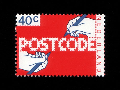
POSTCODE
by nitrada7.55
Click on the stars to rate this FontStruction.
Balanced Rating: 7.55
Average Rating: 7.50
Click for more information about this rating. 26 votes You voted ? for this FontStruction. You may change your vote at any time.
Balanced Rating: 7.55
Average Rating: 7.50
Click for more information about this rating. 26 votes You voted ? for this FontStruction. You may change your vote at any time.
271158713
Published: 6th June, 2008
Last edited: 4th January, 2009
Created: 6th June, 2008
This is still work in progress, a lot of characters missing. There are only UPPERCASE characters available, I filled the lowercase letters with random symbols/patterns. The design is based on this stamp design from 1978 by Gert Dumbar. Use font sizes 64, 128 or 256px. Set leading to 24 (for font size 64), 48 (for 128) and 96 (for 256). More information
staccato swash caps
by typerider6.29
Click on the stars to rate this FontStruction.
Balanced Rating: 6.29
Average Rating: 5.17
Click for more information about this rating. 6 votes You voted ? for this FontStruction. You may change your vote at any time.
Balanced Rating: 6.29
Average Rating: 5.17
Click for more information about this rating. 6 votes You voted ? for this FontStruction. You may change your vote at any time.
Hectic
by elltee6.51
Click on the stars to rate this FontStruction.
Balanced Rating: 6.51
Average Rating: 6.21
Click for more information about this rating. 19 votes You voted ? for this FontStruction. You may change your vote at any time.
Balanced Rating: 6.51
Average Rating: 6.21
Click for more information about this rating. 19 votes You voted ? for this FontStruction. You may change your vote at any time.
991932
Published: 29th May, 2008
Last edited: 3rd August, 2008
Created: 29th May, 2008
This is a clone of Hectic Outline
Last edited: 3rd August, 2008
Created: 29th May, 2008
This is a clone of Hectic Outline
Hectic Outline
by elltee6.85
Click on the stars to rate this FontStruction.
Balanced Rating: 6.85
Average Rating: 6.67
Click for more information about this rating. 24 votes You voted ? for this FontStruction. You may change your vote at any time.
Balanced Rating: 6.85
Average Rating: 6.67
Click for more information about this rating. 24 votes You voted ? for this FontStruction. You may change your vote at any time.
solidad
by intaglio6.49
Click on the stars to rate this FontStruction.
Balanced Rating: 6.49
Average Rating: 5.90
Click for more information about this rating. 10 votes You voted ? for this FontStruction. You may change your vote at any time.
Balanced Rating: 6.49
Average Rating: 5.90
Click for more information about this rating. 10 votes You voted ? for this FontStruction. You may change your vote at any time.
Stealthy Bat
by allanberk5.55
Click on the stars to rate this FontStruction.
Balanced Rating: 5.55
Average Rating: 4.14
Click for more information about this rating. 7 votes You voted ? for this FontStruction. You may change your vote at any time.
Balanced Rating: 5.55
Average Rating: 4.14
Click for more information about this rating. 7 votes You voted ? for this FontStruction. You may change your vote at any time.
Gnaw
by baruag7.44
Click on the stars to rate this FontStruction.
Balanced Rating: 7.44
Average Rating: 6.50
Click for more information about this rating. 2 votes You voted ? for this FontStruction. You may change your vote at any time.
Balanced Rating: 7.44
Average Rating: 6.50
Click for more information about this rating. 2 votes You voted ? for this FontStruction. You may change your vote at any time.
Brooklyn
by T0105.84
Click on the stars to rate this FontStruction.
Balanced Rating: 5.84
Average Rating: 5.27
Click for more information about this rating. 15 votes You voted ? for this FontStruction. You may change your vote at any time.
Balanced Rating: 5.84
Average Rating: 5.27
Click for more information about this rating. 15 votes You voted ? for this FontStruction. You may change your vote at any time.
Konstruct
by afrojet7.22
Click on the stars to rate this FontStruction.
Balanced Rating: 7.22
Average Rating: 7.00
Click for more information about this rating. 13 votes You voted ? for this FontStruction. You may change your vote at any time.
Balanced Rating: 7.22
Average Rating: 7.00
Click for more information about this rating. 13 votes You voted ? for this FontStruction. You may change your vote at any time.
Patrimonium
by Dieter Kors (poekoe)6.35
Click on the stars to rate this FontStruction.
Balanced Rating: 6.35
Average Rating: 4.75
Click for more information about this rating. 4 votes You voted ? for this FontStruction. You may change your vote at any time.
Balanced Rating: 6.35
Average Rating: 4.75
Click for more information about this rating. 4 votes You voted ? for this FontStruction. You may change your vote at any time.
180912
Published: 28th April, 2008
Last edited: 13th March, 2009
Created: 28th April, 2008
I made this font for a project 5 years ago. Inspired by early De Stijl typography such as Van Doesburg posters. This type appears a tiling on a housing project in the 30s in my neighbourhood, called Patrimonium.
Last edited: 13th March, 2009
Created: 28th April, 2008
I made this font for a project 5 years ago. Inspired by early De Stijl typography such as Van Doesburg posters. This type appears a tiling on a housing project in the 30s in my neighbourhood, called Patrimonium.
Skares
by Louis Duchesne (mprsand)6.08
Click on the stars to rate this FontStruction.
Balanced Rating: 6.08
Average Rating: 5.00
Click for more information about this rating. 7 votes You voted ? for this FontStruction. You may change your vote at any time.
Balanced Rating: 6.08
Average Rating: 5.00
Click for more information about this rating. 7 votes You voted ? for this FontStruction. You may change your vote at any time.
FATmarta
by martab6.32
Click on the stars to rate this FontStruction.
Balanced Rating: 6.32
Average Rating: 5.50
Click for more information about this rating. 8 votes You voted ? for this FontStruction. You may change your vote at any time.
Balanced Rating: 6.32
Average Rating: 5.50
Click for more information about this rating. 8 votes You voted ? for this FontStruction. You may change your vote at any time.
Figaro
by Ixel6.94
Click on the stars to rate this FontStruction.
Balanced Rating: 6.94
Average Rating: 6.69
Click for more information about this rating. 16 votes You voted ? for this FontStruction. You may change your vote at any time.
Balanced Rating: 6.94
Average Rating: 6.69
Click for more information about this rating. 16 votes You voted ? for this FontStruction. You may change your vote at any time.
AGRAR Unicase Black
by Ixel6.13
Click on the stars to rate this FontStruction.
Balanced Rating: 6.13
Average Rating: 5.45
Click for more information about this rating. 11 votes You voted ? for this FontStruction. You may change your vote at any time.
Balanced Rating: 6.13
Average Rating: 5.45
Click for more information about this rating. 11 votes You voted ? for this FontStruction. You may change your vote at any time.
8802874
Published: 23rd April, 2008
Last edited: 16th June, 2009
Created: 23rd April, 2008
Clone of AGRAR Unicase.This is a clone of AGRAR Unicase
Last edited: 16th June, 2009
Created: 23rd April, 2008
Clone of AGRAR Unicase.This is a clone of AGRAR Unicase
AGRAR Unicase
by Ixel6.75
Click on the stars to rate this FontStruction.
Balanced Rating: 6.75
Average Rating: 6.38
Click for more information about this rating. 13 votes You voted ? for this FontStruction. You may change your vote at any time.
Balanced Rating: 6.75
Average Rating: 6.38
Click for more information about this rating. 13 votes You voted ? for this FontStruction. You may change your vote at any time.
Fubble
by Dieter Kors (poekoe)6.15
Click on the stars to rate this FontStruction.
Balanced Rating: 6.15
Average Rating: 5.54
Click for more information about this rating. 12 votes You voted ? for this FontStruction. You may change your vote at any time.
Balanced Rating: 6.15
Average Rating: 5.54
Click for more information about this rating. 12 votes You voted ? for this FontStruction. You may change your vote at any time.
12201013
Published: 23rd April, 2008
Last edited: 19th March, 2009
Created: 23rd April, 2008
*** in progress - spacing will change - adding Extende Latin characters *** Heavily rounded and altered clone of Femke. Lower case q stays a little edgy though... :) (Formerly named as DK Femke Bubble.)This is a clone of Femke
Last edited: 19th March, 2009
Created: 23rd April, 2008
*** in progress - spacing will change - adding Extende Latin characters *** Heavily rounded and altered clone of Femke. Lower case q stays a little edgy though... :) (Formerly named as DK Femke Bubble.)This is a clone of Femke
Femke
by Dieter Kors (poekoe)6.65
Click on the stars to rate this FontStruction.
Balanced Rating: 6.65
Average Rating: 6.00
Click for more information about this rating. 8 votes You voted ? for this FontStruction. You may change your vote at any time.
Balanced Rating: 6.65
Average Rating: 6.00
Click for more information about this rating. 8 votes You voted ? for this FontStruction. You may change your vote at any time.
11812073
Published: 15th April, 2008
Last edited: 18th March, 2009
Created: 15th April, 2008
Inspired by Braggadocio and Futura Black, a typeface based on a 2 by 3 grid (mostly) using only 6 FontStruct elements. v2 - Updated 18 March 2009 - Changed spacing, added Extended Latin (108 characters extra!). Reviewed and adjusted characters a l ? ! ( ) <> Note for use: you probably have to set the tracking to a desired amount.
Qwerty Revisited
by geniaal6.10
Click on the stars to rate this FontStruction.
Balanced Rating: 6.10
Average Rating: 5.80
Click for more information about this rating. 25 votes You voted ? for this FontStruction. You may change your vote at any time.
Balanced Rating: 6.10
Average Rating: 5.80
Click for more information about this rating. 25 votes You voted ? for this FontStruction. You may change your vote at any time.
Qwerty
by geniaal6.97
Click on the stars to rate this FontStruction.
Balanced Rating: 6.97
Average Rating: 6.20
Click for more information about this rating. 5 votes You voted ? for this FontStruction. You may change your vote at any time.
Balanced Rating: 6.97
Average Rating: 6.20
Click for more information about this rating. 5 votes You voted ? for this FontStruction. You may change your vote at any time.
Pullchain
by dcsudweeks7.92
Click on the stars to rate this FontStruction.
Balanced Rating: 7.92
Average Rating: 7.93
Click for more information about this rating. 29 votes You voted ? for this FontStruction. You may change your vote at any time.
Balanced Rating: 7.92
Average Rating: 7.93
Click for more information about this rating. 29 votes You voted ? for this FontStruction. You may change your vote at any time.
MIKEY
by afrojet7.62
Click on the stars to rate this FontStruction.
Balanced Rating: 7.62
Average Rating: 7.40
Click for more information about this rating. 5 votes You voted ? for this FontStruction. You may change your vote at any time.
Balanced Rating: 7.62
Average Rating: 7.40
Click for more information about this rating. 5 votes You voted ? for this FontStruction. You may change your vote at any time.
Fat Tek Brush
by TobiasMik8.21
Click on the stars to rate this FontStruction.
Balanced Rating: 8.21
Average Rating: 8.38
Click for more information about this rating. 8 votes You voted ? for this FontStruction. You may change your vote at any time.
Balanced Rating: 8.21
Average Rating: 8.38
Click for more information about this rating. 8 votes You voted ? for this FontStruction. You may change your vote at any time.
1090655
Published: 8th April, 2008
Last edited: 16th January, 2009
Created: 8th April, 2008
A techno style typeface with a calligraphic twist (or calligraphic with a tech-twist!!) I've explored the rounded brushstrokes against straight lines and got a nice dynamic result. – with cool lowercase numbering
Last edited: 16th January, 2009
Created: 8th April, 2008
A techno style typeface with a calligraphic twist (or calligraphic with a tech-twist!!) I've explored the rounded brushstrokes against straight lines and got a nice dynamic result. – with cool lowercase numbering
Out of Context
by Friedrich Hartmann (@mxfh) (diskurs)5.85
Click on the stars to rate this FontStruction.
Balanced Rating: 5.85
Average Rating: 5.00
Click for more information about this rating. 10 votes You voted ? for this FontStruction. You may change your vote at any time.
Balanced Rating: 5.85
Average Rating: 5.00
Click for more information about this rating. 10 votes You voted ? for this FontStruction. You may change your vote at any time.
gordcheeenha
by armandofontes6.82
Click on the stars to rate this FontStruction.
Balanced Rating: 6.82
Average Rating: 5.33
Click for more information about this rating. 3 votes You voted ? for this FontStruction. You may change your vote at any time.
Balanced Rating: 6.82
Average Rating: 5.33
Click for more information about this rating. 3 votes You voted ? for this FontStruction. You may change your vote at any time.
testcard
by spittingcat6.68
Click on the stars to rate this FontStruction.
Balanced Rating: 6.68
Average Rating: 5.00
Click for more information about this rating. 3 votes You voted ? for this FontStruction. You may change your vote at any time.
Balanced Rating: 6.68
Average Rating: 5.00
Click for more information about this rating. 3 votes You voted ? for this FontStruction. You may change your vote at any time.
290301
Published: 4th April, 2008
Last edited: 5th April, 2008
Created: 4th April, 2008
The result of my first play with fontstruct. It's an utterly flawed font, take it and fix it as you see fit. Underscore is used to to terminate and separate words. There's only a handful of characters I'm happy with so far.
Last edited: 5th April, 2008
Created: 4th April, 2008
The result of my first play with fontstruct. It's an utterly flawed font, take it and fix it as you see fit. Underscore is used to to terminate and separate words. There's only a handful of characters I'm happy with so far.
kaputt
by alziro5.84
Click on the stars to rate this FontStruction.
Balanced Rating: 5.84
Average Rating: 5.56
Click for more information about this rating. 31 votes You voted ? for this FontStruction. You may change your vote at any time.
Balanced Rating: 5.84
Average Rating: 5.56
Click for more information about this rating. 31 votes You voted ? for this FontStruction. You may change your vote at any time.