New T-Shirts
News | Rob Meek (meek) | January 19th, 2011
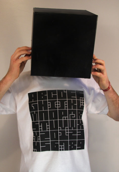
Over the last few weeks, FontStruct intern Lorenz Fidel Huchthausen AKA Tylo has been busy designing and testing some great new FontStruct T-Shirts. Here he is sporting the “T-FX 361331” design which showcases the wonderful “fs I Square” by minimum. We thought it would make sense to offer some merchandise which showed off the talent of FontStruct designers, to compliment the existing products based on the FontStruct logo.
All money raised by merchandise sales will go directly towards the development and maintenance of FontStruct – so buying a T-shirt or a bag is a great way to enhance your wardrobe and support the site.
Here are some pictures of the new tees.
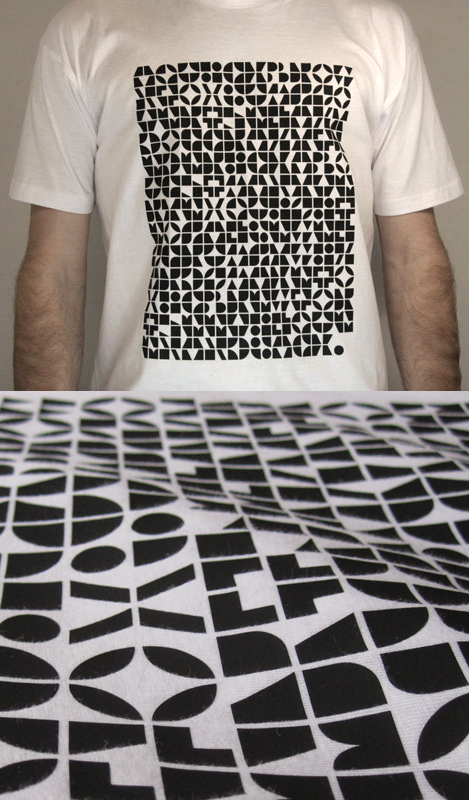
T-FX 251673 using abstract letter patterns by Cmunk
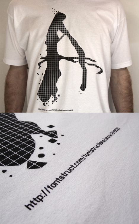
T-DD 249030 using Bat Country by loboarches
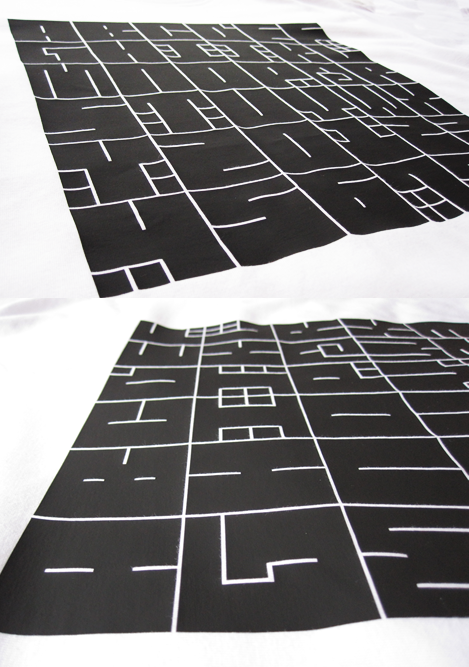
T-FX 361331 using fs I Square by minimum
Two shops
We now offer a choice of two online shops. There’s http://fontstruct.spreadshirt.com based in North America with prices in dollars, and http://fontstruct.spreadshirt.net based in Europe with prices in Euros. The products offered, the pricing and the shipping costs will differ. Normally users in the Americas and Asia are advised to visit the North American shop, while those in Europe should visit the European one. A full list of shipping destinations and shipping costs can be found here (for the North American shop) and here (for Europe).
We’ve also introduced a simple product coding system, mainly to allow users to differentiate between the different printing techniques used for the merchandise. Products are coded like this:
T-FX 361331
(type of product)-(printing method) (font id-number)
All the merchandise is printed, sold and shipped using Spreadshirt. Here’s some information about their printing techniques:
Flex (FX) is a printing technique where the design is cut from a colored foil and then pressed onto the shirt under high heat. Flex printing is suitable for vector graphics and the results are extremely durable. The colors are strong and saturated colors and shapes have sharp edges.
Digital Direct (DD) is a real print with the design sprayed directly onto the apparel, so the contours can be a bit blurry in comparison to Flex and Flock. Colors are softer and will fade more quickly than other techniques but some people (including myself) may like this effect. One advantage of digital direct is that it allows us to print fine lines and small text.
Flock (FK) is also a foil like Flex, but it has got a velvety surface.
Happy shopping!


Am I wrong, or the font “fS 1 square” is from Minimum and not by Thalamic ?
– neurone error — January 19, 2011 #
@neurone_error thanks yes you’re right. we’re correcting the post now. I think minimum and thalamic know each other very well though ;-)
– Rob Meek (meek) — January 19, 2011 #
*haha* Even I didn’t pick-up on that error.
Great T-shirt designs. Thanks for including mine in the first set. I’m honored.
Best wishes for the project.
:-)
– thalamic — January 19, 2011 #
Wow! Really cool T-shirt-designs. I’m definately going to buy some… next payday.
And I’m really thrilled to have my font on a T-shirt. Thank you!
– CMunk — January 19, 2011 #
Ah, man.. this is cool. Too bad spreadshirt doesn’t offer an API that you could feed anyone’s font into, that would be (somewhat obviously) awesome. :D
– stevecooley — January 19, 2011 #
@stevecooley They do have an API
– Rob Meek (meek) — January 20, 2011 #
minimum’s shirt looks awesome ;)
They all look really good actually. My favorite font here is bat country… I don’t actually like buying shirts online, so I don’t think I will get one. If I ever saw any of them in a store I would get one. ( I have a feeling I wont )
:(
– Drgrit — January 20, 2011 #
These look the bomb guys! loving the abstract letter patterns shirt, i need to get me one of those.
Thanks for using bat country for your first designs, im really chuffed!
– loboarches — January 21, 2011 #
Wow gr8. i like d tshirt design concepts. now wud like 2 c one where many fontstructions will b involved. and btw… why fonstruct dnt make an app for android… and iphone. wud gv reasons 2 b more creative even on d move.
– softhunterdevil — January 25, 2011 #
@softhunterdevil Yes, a shirt with multiple FontStructions would be great. I’d like to make a mobile version of FontStruct at some point. Any experienced mobile developers out there who are interested should get in touch.
– Rob Meek (meek) — January 26, 2011 #
@ Cmunk: Cool patterns! I’m inspired! >:D
– Bismuth — January 26, 2011 #
Hi I was surprised to see the first image. The font used is really similar to my font Quincha (http://issuu.com/diegosanzsalas/docs/quincha_specimen) I released it via Cocijotype foundry in november of 2009. Previously I have designed some fonts here in fontstruct. In march 2010 it was the first peruvian font to be choose in the biannual Tipos Latinos. Your blog fontfeed published the list with the winners and on the October edition of the german magazine PAGE it was published (http://a5.sphotos.ak.fbcdn.net/hphotos-ak-snc4/hs757.snc4/65701_436480002110_717377110_5889241_5523372_n.jpg)also in Typodarium 2011 the font is in November 9th. The poster that has been used in the biannual and the page dedicated to Quincha in Cocijotype’s specimen (http://issuu.com/mguerrero/docs/cocijotype ) have the same design proposed in he t-shirt. The author of fs I Square is Ata Syed he has two names in fontstruct minimum and thalamic. He saw my font sencilla ,created on fontruct and said “Awesome” My concept for Quincha was to create a font where every character is like an inca rock that’s why the counter is filled with small “rocks”. Mr Syed created fs I Square in less than 30 hours and it seems strange to me he uses the same shapes for almost every character. I would like to know if this is a coincidence. A font with the same concept, shape and solutions and a very pretty similar design applied on a t-shirt. I’ll be waiting for Mr Syed and Lorenz Fidel Huchthausen comments.
– Diego Sanz Salas — February 2, 2011 #
@Diego Thanks for pointing out the similarities between fs I Square and your excellent Quincha design, and congratulations on your award in Tipos Latinos. I think it’s hard to avoid the appearance of similar designs when creating modular type – whether by coincidence, or conscious or unconscious inspiration. Designers are always going to come up with similar ideas and make similar decisions. Personally I think there are a lot of differences between your work and fs I Square. I’d also note that fs I Square was a cloned part of a series (not the first) so the relatively short creation time doesn’t surprise me at all. Ata Syed has created and shared a large number of diverse and original typefaces on FontStruct and has also been a prodigious commenter so I really don’t see anything suspicious here. Good luck with your type design, and I really hope you continue to share work on FontStruct.
– Rob Meek (meek) — February 3, 2011 #
I also think “FS1Square” and “Quincha” are “esthetically” different, even if they share the same modular idea and system. And for me it’s the final esthetic that makes the difference,(Minimum one has a more purely constructivist feel, Diego’s one, is effectively more Inca related) not the concept or the system used to build it, which is finally only a tool, cause with the same idea and system we can produce many different things, and that’s not because you did not create the tool yourself that you can’t use it to make something personal with it. To push the idea to the extreme, then every work on Fontstruct should be signed by Rob Meek and in the non modular world by Adobe ! I’m always amazed that there are thousands of more or less copies of Helvetica, Garamond, Arial or Times new Roman sold on the market, which completelely uniform our world so that we can’t make a move without seeing them, and no one complains about it, complaints always come when similar designs are at a really small scale, when we are invaded everyday by similar and in my opinion ugly fonts in every book, magazine, or newspaper we open, and apparently when we see the bestseller of the Pro sites, they are precisely these very similar Helveticalike or Garamondlike or Ariallike, and the foundries that make the more money more or less endlessly copy the same pattern created by the “modernist typographers” who created the original fonts at the beginning of the 20th century, but that seems obviously natural to everyone, not to me for sure !
– neurone error — February 3, 2011 #
*speechless*
– Ata Syed — February 4, 2011 #
Hey Diego,
I can assure I didn’t take anything for inspiration except for ‘FS I Square’ and the square-brick of the fontstructor.
I think it’s obvious to make a square shirt-design for a font that has got square letters build of square bricks.
You’re work is cool, congratulations on your award!
And keep fontstructing!
– Tylo — February 7, 2011 #
Tylo it’s very interest pattern!
– warriorhonor — February 8, 2011 #
Abstract Letter Patterns by CMunk – also an excellent choice by you guys. In my book, it is one of the most brilliantly conceived and executed minimal and avant-garde font in all of fontstructland. Every time I see this font, I am amazed that it can be read as latin characters at all with such a non-letterlike, totally strict, and, well, abstract construction method. Tylo’s design further highlights the bricks in a clever reference to the fontstructor. By aligning all the letters into a unified grid matching letter and line spacing, the paragraph of text becomes a unified visual element. Definitely decreases legibility, yet all in the name of minimalism and effective communication! ;)
– will.i.ૐ — February 8, 2011 #
Epic. I might have to get one.
– FangedWallaby — February 9, 2011 #