


The First Three Weeks
News | Stephen Coles | April 22nd, 2008
 On April 1, after months of planning, designing, production, and testing — not to mention endless mulling over licensing schemes — we took a deep breath and lifted the gates, opening FontStruct to the general public. To give the servers a gentle test, we decided not to announce the site right away. We leaked the news to a few close friends and went back to our regular FontShop duties.
A few days later, I turned to our intern Ivo, who sits next to me, and whispered what was then an unbelievable figure: “1,500!”. That was how many FontStruct users had registered by the end of the first week.
First FontStructions
More impressive than the size of the crowd was the quality and variety of their creations. Within hours, FontStructors were designing modular typefaces that pushed beyond typical pixelations.
- Gareth Finucane used triangle bricks to create depth for his xtrude,
- Zara Evens crafted an elegant inline face that works equally well at display and pixel sizes,
- Nate Cox built a faithful replica of the quirky electronic displays found on board San Francisco’s MUNI trains,
- FontShopper Ivan Bettger was stealing a few minutes between type research and support calls to fashion a convincing blackletter,
- and Mark Simonson dug up his 30-year-old graph paper alphabets and brought the sketches to life as Boxy 1 and 2.
FontStruct At 21
FontStruct is now 21 days old and the enthusiasm of its users continues to exceed our expectations. Here are our baby’s vital stats as of today:
- 21,620 registered users
- 23,323 FontStructions (716 public)
- 367,921 glyphs
- 29,991 FontStruction downloads
Though April hasn’t passed and we have yet to lift the obligatory “beta” label, FontStructing techniques have already evolved significantly. The perfect case-in-point is Wolfgang Krimmel’s recently completed Texture, a fraktur that appears to defy the modular tool that created it.
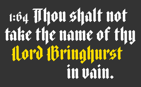
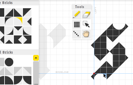
The implied stroke of a pen is captured so well it’s hard to believe that it was built, brick by brick, with sections of triangles, rectangles, and circles on a grid. A closer look within the editor reveals the genesis of Texture:
Onward to Week Four
Of course, this is only the beginning. We continue to refine the site and FontStructor daily. Thank you to all for your feedback and suggestions. We can’t fulfill every wish (sorry pro’s, class-based kerning is a long way off) but we read every email and some of your excellent ideas are already in production. You might have noticed that half- and quarter-sized rectangles magically appeared in your Brick palette this week.
Fonts used in opening image: SquareSans and Texture.
Thanks for adding more brick shapes! My FontStructions now look almost exactly as I designed them on graph paper more than 20 years ago.
– James Vipond — April 22, 2008 #
Great to hear, James. I dig Octic.
– Stephen Coles — April 22, 2008 #
An utterly fantastic program. It’s too good; I’m not getting much sleep.
I love the way the toolbox limitations morph your typographic intentions into something… else.
I’m in two minds whether a more extended toolset would rob FontStruct of some of its charm. I’m a bit torn. On the one hand I’d love to have a go at a “real” font; on the other, maybe more tools would stop sideways-thinking.
– John Berkley (intaglio) — May 20, 2008 #
wow!
i cant believe this page is that “young”.
such a huge output in less than three months! unbelievable!
you guys do a real amazing job.
thanks for this supergreat applet/website!
– kix — June 10, 2008 #